8 Surprising Mistakes From Interior Experts That Make Your Home Look Cheap


WHEN it comes to selling your home, everyone wants to make more than the asking price.
And when potential buyers walk into a home, they immediately judge what it’s worth based on a few simple things they notice first.
This means that if you make an interior design mistake that makes your home look cheap, it could cost you thousands of euros.
Interior expert Liv Conlon, CEO of ThePropertyStagerssays: “I know what to do to impress buyers – and what mistakes homeowners make when it comes to decorating.
“And a few small adjustments don’t have to be expensive either.
“Yes, you can spend a lot of money on a super luxurious look for your home.
“But with the right guidance and by changing a few things — like dressing your windows, choosing the right dimensions for accessories and limiting the number of colors in one room — you’ll be on your way to making your home stand out for all the right reasons.”
In this article, she reveals the eight biggest mistakes she often makes when it comes to decorating – and why they make your home look cheap.
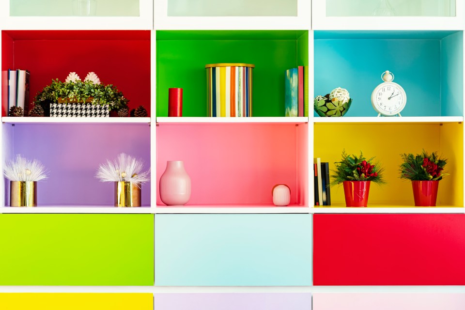
Mixture of colors
No one wants to feel overwhelmed by an array of colors when they walk through the front door,
Too many colors will make your home look disorganized and cheap, like a hodgepodge instead of a well-designed space.
Remember that potential buyers are wondering if they could live in your home. If the house is a flashy mix of blue, green, red and yellow, it will miss the mark.
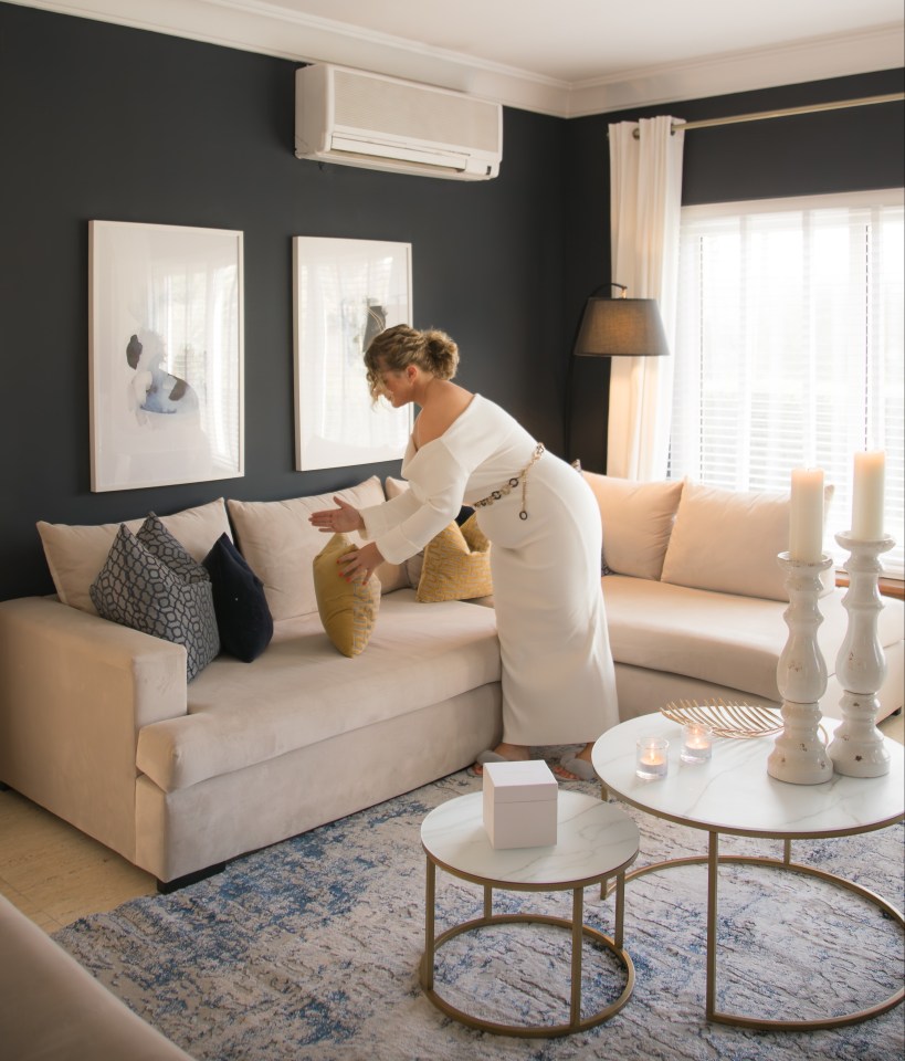
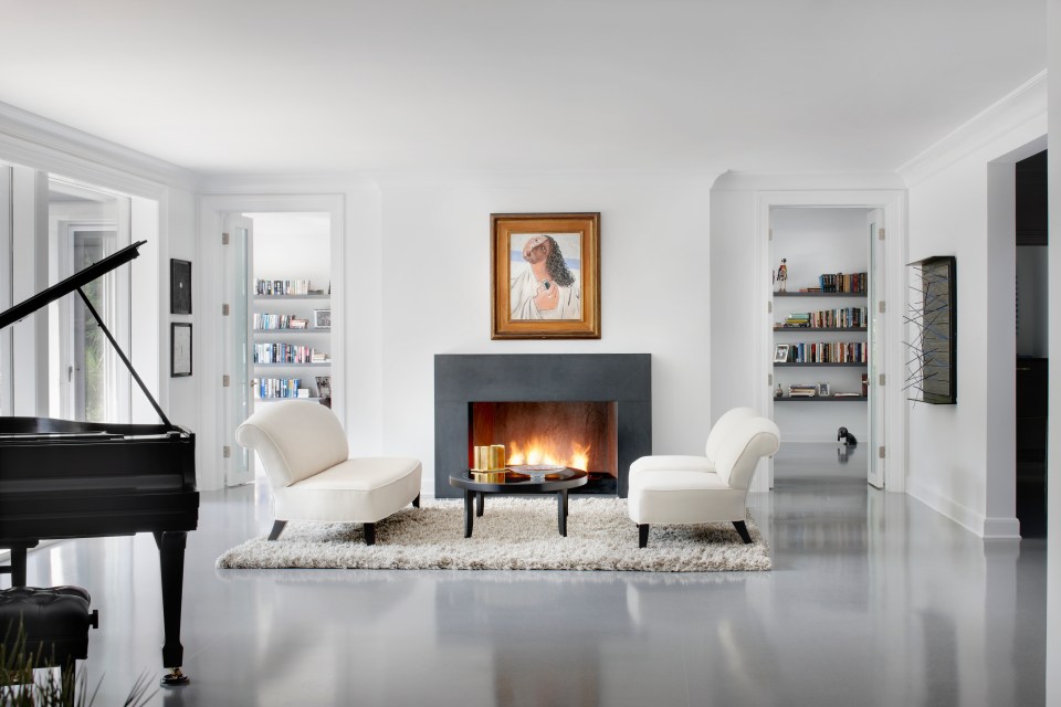
Opt for a neutral color palette that flows through the different rooms and your home will look more refined.
Artwork at eye level
Hanging paintings or pictures at the wrong height on the wall can disrupt the balance of a room and create a lopsided feeling.
The center of the artwork should always be at eye level, approximately 145-150 centimeters above the floor.
Don’t hang small objects loosely on large walls. Group them or choose larger, eye-catching objects.
OTT decoration
Yes, you may love all things nautical, but rooms that are too overdone in style can make a home feel more kitschy than stylish.
A complete farmhouse kitchen or a living room full of different types of floral prints can quickly make your home look dated.
Instead, incorporate subtle references to your theme through texture or color for a more refined, timeless look.
Cover your windows
Bare windows can make a room look unfinished, while cheap, plastic blinds or outdated curtains can bring down the entire appearance of a room.
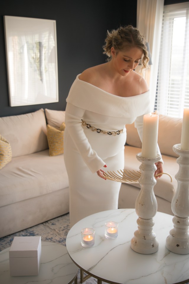
Invest in quality window treatments such as linen curtains, woven roller shades or simple yet elegant roller shades to enhance the space.
Custom treatments always look more sophisticated than off-the-shelf options.
The wrong size carpet
Big is beautiful! Using a rug that is too small for a room or for the furniture group it belongs to will not do your style any favors.
Rugs should be large enough to ‘anchor’ the room. Make sure that at least the front legs of furniture are on the rug.
In living rooms, choose a size of 8x10m or larger for more impact.
Under- or over-furnishing
Too much furniture in a room can make it look cramped and cluttered, while too little furniture can make the room look empty and unfinished.
Aim for balance: place furniture so that it enhances the space and feels functional.
If the room feels empty, add a few well-placed accessories or plants to fill gaps without overcrowding.
Don’t pretend
Fake plantsplastic furniture or imitation materials look very cheap.
If you can’t afford the most expensive finishes, you can add natural materials like wood, stone and living things. plants can bring warmth and refinement.
Even if you have a limited budget, choose materials that feel authentic and avoid too many artificial accents.
Don’t make a mess
Arrange your room so that everything has a fixed place, even if it’s just to store things.
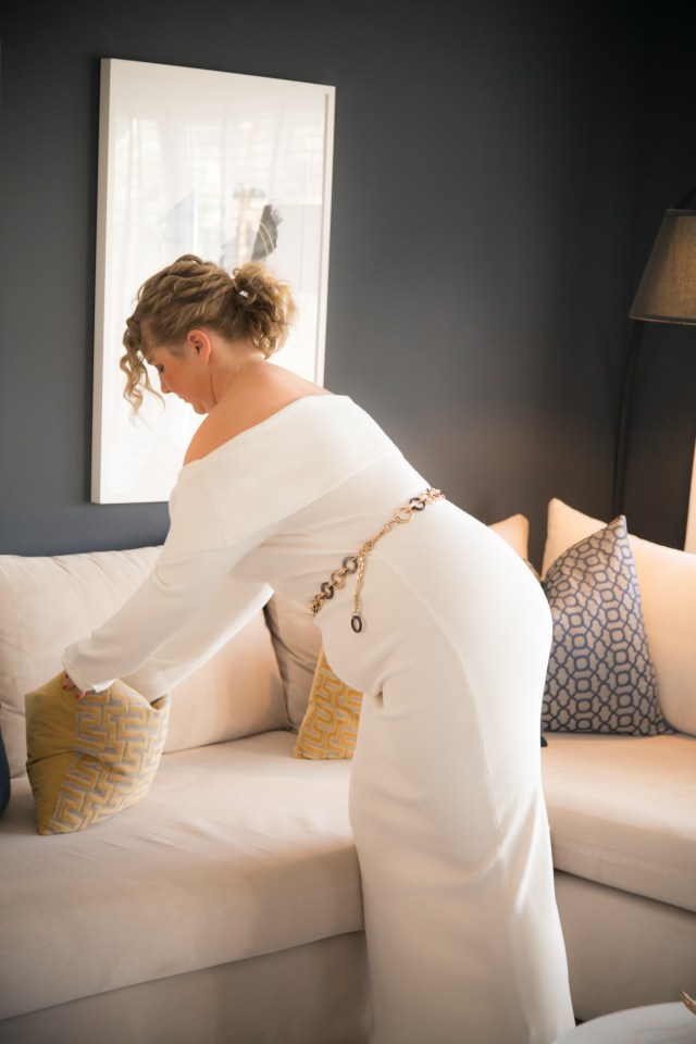
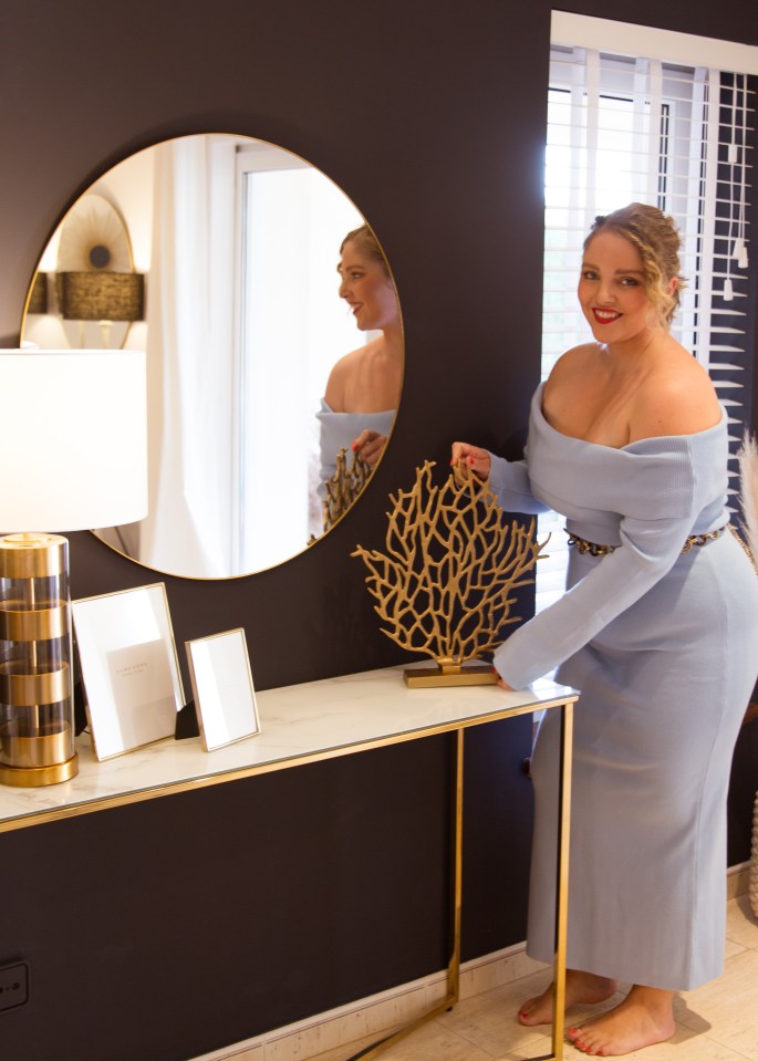
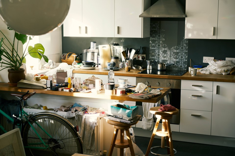
Don’t place too many accessories, such as photo frames, vases, etc. If there are too many things in sight, it will look cluttered.
Customize your accessories by selecting a few key pieces that bring the room together.
Group items in odd numbers and vary heights and textures for a more polished, professional look.
Small changes that can increase the value of your home

By Liv Conkon, interior expert and CEO of ThePropertyStagers
Create a focal point:
Bare or poorly furnished rooms create a restless and directionless view.
As a homeowner, you want to attract attention and create a sense of balance and harmony in your spaces. This will give the viewer the feeling that the home is attractive and they can imagine what it would be like to live there.
If you don’t have one, use a piece of art or a striking piece of furniture.
Remove furniture from the walls:
Most people push their furniture against the walls, but this makes the room feel more like a hallway or gallery than a space where you can gather with your family.
Instead, you can also create cozy nooks by moving furniture away from the walls (especially if you live in a large space). If you live in a smaller room, you can place the central piece of furniture against the wall and center all the other furniture around it.
This arrangement provides better flow and makes the room feel more inviting and spacious.
Touch-up paint:
Damaged walls from a chaotic family life can make a home look neglected and leave a trace of the owner’s home behind, making it harder for a viewer to feel like this could be their new home.
Touching up your walls can help hide minor blemishes, such as scuffs and scratches.
Afterwards, your home will look well-maintained and cared for, rather than neglected and unloved. It also creates a brilliant first impression.
Invest in white bedding:
Invest in quality white linens that look crisp, exude a sense of cleanliness, and create a serene and inviting oasis that appeals to buyers looking for a peaceful retreat.
This versatility makes it easy for potential buyers to imagine their own decor in the space. You can add color with pillows and a textured throw.


