Camera comparison iPhone 16 Pro vs Pixel 9 Pro – Video

iPhone 16 Pro vs Pixel 9 Pro camera comparison
iPhone 16 Pro vs Pixel 9 Pro camera comparison
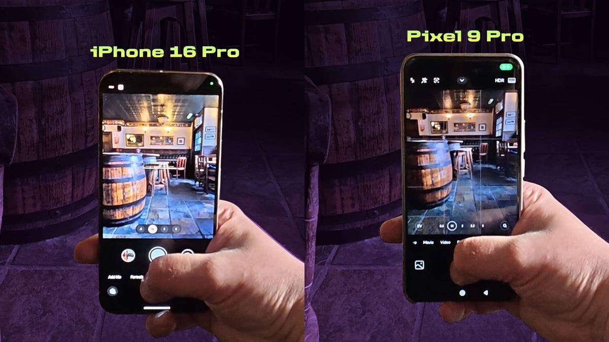
How does the iPhone 16 Pro camera compare to the Pixel Nine Pro? Let’s see if Apple’s iPhones always have the best cameras you can find in a phone. And so far, the iPhone 16 Pro appears to be no exception in our tests. But the Pixel Nine Pro XL also has a fantastic camera that allows you to take beautiful photos. How does the new iPhone compare to Google’s best? Well, I took them for a photo battle around the beautiful city of Edinburgh to find out. I immediately found this scene of some beautiful fallen leaves showing off their beautiful golden colors, right away. I can see those colors being warmer and more vibrant on the pixel, where the iPhone shots look a bit dull and cold. By comparison, the Pixel has warmer tones in this shot, which takes advantage of the fivex optical zoom on both phones, and the iPhone’s colder tone is especially noticeable in this image overlooking these allotments. While the pixel image is fairly neutral in tone, the iPhone shot leans quite hard into the blue end of the white balance spectrum, which doesn’t look that great in my opinion. I certainly don’t get the cozy, warm atmosphere of four and the same goes for zooming five times, where the pixel produces bolder, warmer tones. However, I used the iPhone 16’s new photographic styles to try and add some warmth to the scene and I think it looks much better, but I still prefer the richness of color in the pixel capture, but things suddenly look different in this example, taken in Edinburgh’s beautiful Dean Village. The iPhone captured a brighter scene overall here, especially noticeable by the yellow building on the right and the grasses in the foreground. I definitely prefer the iPhone version of this image that delves into the beautiful architecture of the National Museum of Scotland. The iPhone has once again produced a brighter, more vibrant image here. I especially love the warmer tones in the orange floor, while the pixel capture looks quite dull. Overall, it’s the same story when I switch to the ultrawide lens, with the iPhone’s image looking bright and colorful and the pixels looking quite flat. I just went ultra-wide, that wasn’t enough. That’s why I switched to panorama mode. The Pixel has an updated panorama mode, but overall I find it a bit disappointing. It’s not just that it delivered a flatter image than the iPhone did here. It’s also true that the method of stitching together still images made it harder for me to centralize the view. While the iPhone’s elaborate method of capturing a panorama allowed me to start and stop the image capture process at exactly the points I needed to get an even image. At this point. Back in my day, I needed coffee to refuel and like any good coffee nerd. I had to take a photo. This indoor shot of my lovely flat white is much brighter and more vibrant on the iPhone. And to be honest, I actually found the pixelated version of this image to be very disappointing in terms of caffeine intake. However, it was time to go to the pub. There’s a little less difference between these two shots, taken in one of Edinburgh’s many old pubs, but the pixel has more even exposure with fewer highlights on the cylinder. However, the tones and contrast look better on the iPhone, especially in the tiled floor that really stands out in the iPhone’s image. I’m not just going to sit in a pub and not drink. So I got a pint and it photographed well by both phones with a slight magenta shift on the pixel. There is more background blur or OK as photographers call it in the iPhone shot, which makes it a more pleasing image to my eyes, but there really isn’t much to it. And then I went to another pub, because why not turn a phone test into a pub crawl? And it happened to be packed with punters enjoying an afternoon of live folk music. The players’ iPhone shot has better colors overall, but the Pixel simply has the edge when it comes to sharpness. Zooming in on this beer tap in the dimly lit room. The iPhone’s image is noticeably brighter and sharper than the pixels by the end of the day. It was time for dinner. So I left the pub and went to this lively indoor street food market instead. The pixel image here is generally a little brighter than the iPhone’s, but that’s not the whole story when you zoom all the way in. We can also see that the pixel has completely blown out this neon sign, reducing it to just an empty white square. The iPhone has balanced the highlights much better, keeping the sign perfectly under control, but the hair of the person in the foreground looks a little brighter and sharper on the pixel, while still zooming in on a different part of the same scene. Clearly the iPhone made this person’s shirt and hair much sharper than the pixel could do. So overall it feels like a win for the iPhone, but it’s really close here. But this one wasn’t that close for me. The Pixel’s night mode has artificially brightened the shadows in this street scene so much, but the whole image looks quite unnatural. The iPhone, meanwhile, retains much more natural shadows, along with subtler tones in the sky, making its shot the clear winner for me, the iPhone easily winning here too. The pixel has pulled back the highlights in its image in a ridiculous way, making the usually bright and vibrant ESF mark and lights in the windows on the left just look weird. The iPhone captured the scene much more evenly. I’m not too fond of the lens flare in the iPhone store, but it looks more like it was a small blemish on the lens than just lens flare. I’d had quite a few beers at this point, so perhaps I just wouldn’t have cleaned it as effectively if I had to switch to the ultra-wide lens indoors. The pixel shot has the better colors, but the shot is downright blurry compared to the iPhone shot. A disappointing performance from the Pixel here, although Google’s phone has redeemed itself to some extent. I prefer the warmer glow the pixel captured on the window light in this image. While the iPhone shot is slightly sharper on the blackboard on the right, I probably have to pass this almost to the pixel, but I definitely prefer the iPhone in this zoomed-in nighttime shot. The bright tick has been kept under control, making it look rich yellow rather than faded, almost white. In the pixel version. The pixel capture is slightly sharper, but with more detail in some of the fine areas. So which one actually takes the better photos. Both the iPhone 16 Pro and the Pixel Nine PRO XL are both flagship phones. Definitely at the top of their game. So it’s actually no surprise that there isn’t much to choose from in terms of camera performance. Some of my photos, especially the ones I took in the museum using wide angle and panorama mode. The iPhone was bright, but the pixel’s warmer tone and more vibrant colors helped it come out on top. Overall, I’d probably have to say that I generally prefer the look of the iPhone images. They give a slightly more natural look, giving me a better basis to apply my own edits to them. Then of course there’s the matter of the iPhone sixteen’s new photographic styles, which give you a lot of room to customize your photos before you’ve even taken them. I really enjoyed using them, especially when using the high contrast black and white mode. It’s that kind of creative photography that’s missing on the pixel. What do you think of the two phones? And what do you think of the images you saw in this video? If you think there’s a clear winner one way or another, leave your thoughts in the comments below and of course check out the video description for lots more information.


