iOS 18 Is Here: Level Up Your iPhone with These Must-Try Settings




It may be more locked down compared to what you can do with an Android, but it’s always fun to make your iPhone look exactly the way you want it. With the latest iOS update, iOS 18, you have tons of ways to change up how your phone looks and feels. There’s a ton of new ways to customize your Home Screen alone, as well as ways to access your iPhone remotely. There are also new formatting options in Messages. And let’s not forget about the complete overhaul of the Photos app, which may feel different at first, but will come to feel like a familiar favorite.

To help you get started, I’ve put together my list of seven features and settings you should change right now, including some of the top-tier features and a few that fly under the radar. Although Apple Intelligence isn’t quite here yet (unless you install the iOS 8.1 public beta), there’s still a lot to explore.
For more on what’s new in iOS 18, learn about improvements to Apple Maps and the Messages app. Don’t forget to consult the iOS 18 upgrade checklist, which includes making sure you have a proper backup before upgrading.
Change the default buttons on the lock screen
In real estate, location is everything, and the bottom corners of the iPhone lock screen are the prime spots, each an easy thumb press away when your device is still locked. Before iOS 18, those posts were held by the flashlight and camera buttons, with no way to change them.
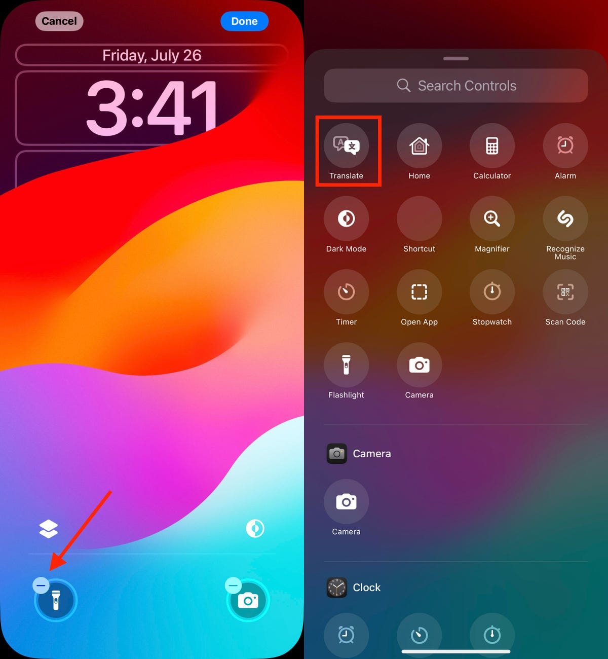
In iOS 18, you can finally replace them with other buttons — or remove them entirely, a balm for folks who unknowingly activate the flashlight (believe me, there’s a better way to turn it on). You can add buttons to recognize music via Shazam, enable Dark Mode, set an alarm/timer, enable Airplane Mode, open your Wallet, send money via Tap to Cash and more.
Here’s how:
1. On the iPhone’s lock screen, touch and hold anywhere on the display until you see the Customize button. You’ll need to unlock the phone using Face ID, Touch ID or your passcode. If it opens the home screen, swipe down from the center-top of the screen (not the right edge, which brings up Control Center.
2. Tap Customize and then choose Lock Screen.
3. Remove one of the buttons by tapping the – (minus) button on the icon.
4. To replace the button with another function, tap its space (now with a + icon) and then choose the one you want on the next screen. (You can also opt to leave that space empty with no button.)
5. Repeat those steps for the other button if you want to change it.
6. Tap Done when you’re finished.
7. Tap the lock screen again to exit the customize mode.

Remove a lock screen button by tapping the – (minus) button, and then choose a new control to replace it.

Watch this: 11 Hidden Features in iOS 18
Set up some of the new tasks available on the Action button
The Action button on the iPhone 15 Pro and iPhone 15 Pro Max replaced the dedicated mute switch found on every other iPhone model with a configurable control. By default it serves the same purpose — hold it to turn Silent Mode on or off — but you can configure it for other actions like opening the Camera app, performing multiple actions at once or even ordering coffee.
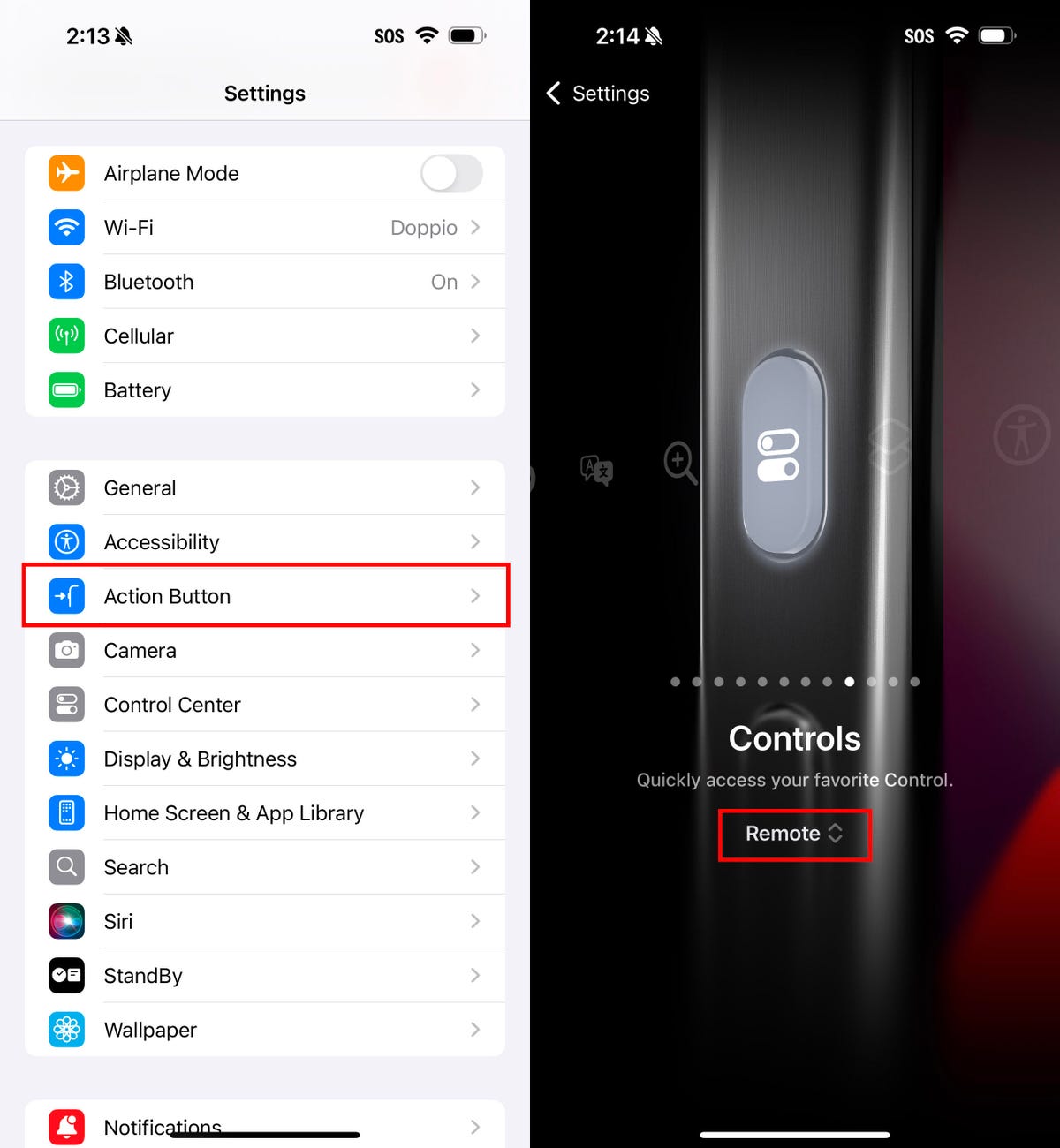
In iOS 18, the Action button gets new capabilities. You can bypass Control Center and choose a control of your choice, such as opening the Remote interface for navigating Apple TV or using Shazam to identify a song.
To choose a different action for the Action button, go to Settings > Action Button. Swipe sideways to select and activate one of the available actions. For the Controls, Shortcut and Accessibility options, tap the Choose button to pick which specific action to run.

iOS 18 now lets you program the Action Button with your favorite Control Center control.
Give your home screen a radical new look
You wouldn’t think that putting icons where you want is a radical new feature, but that’s because iOS has always had a locked arrangement. Apps get added from top to bottom, left to right. You could rearrange the order in which icons appear and move them to other screens, but that was about it.
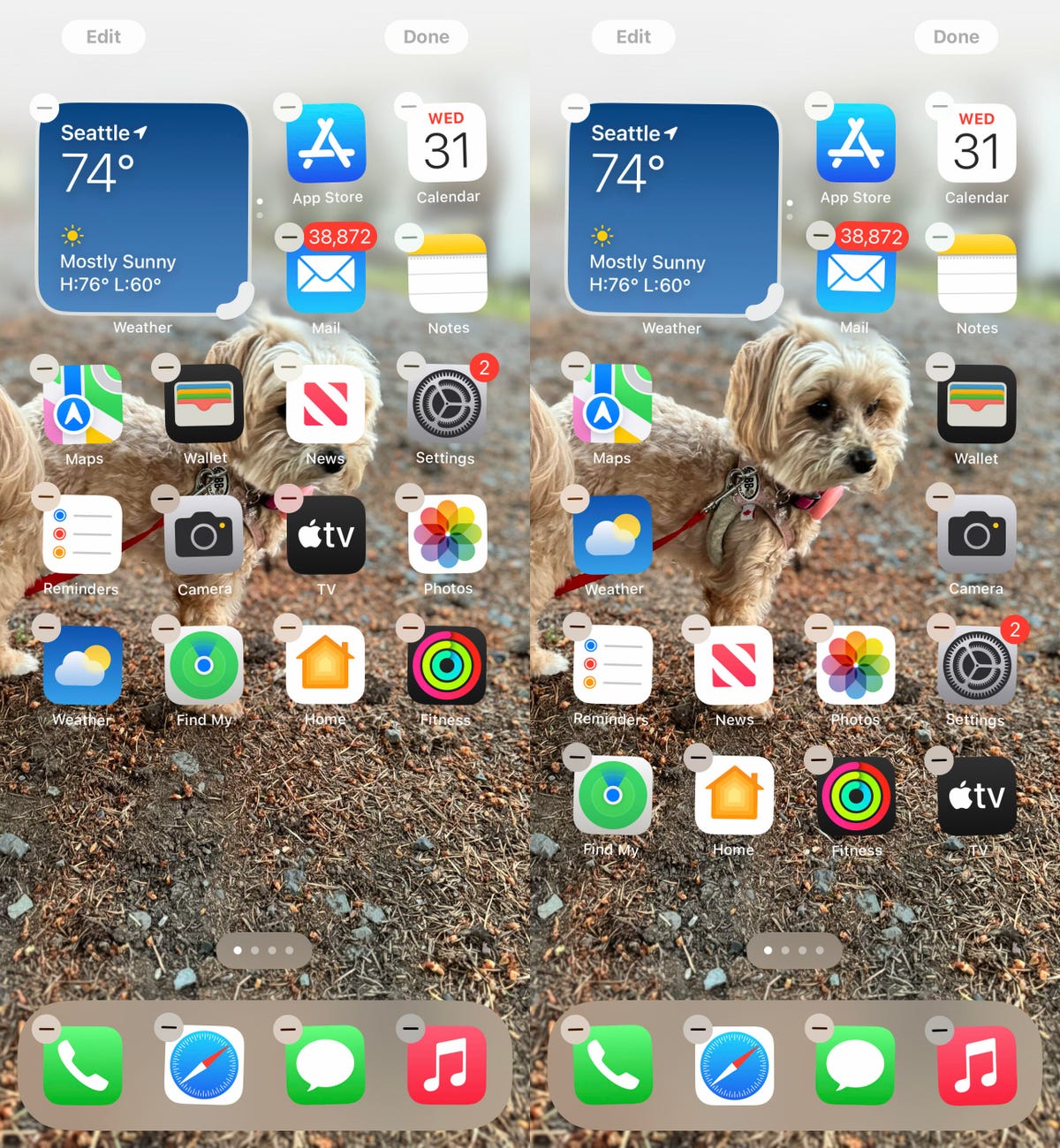
In iOS 18, apps can be positioned nearly anywhere, You no longer need to deal with a wallpaper image of your kids or pets being obscured by icons. They still adhere to a grid — Apple isn’t about to sanction anarchy — but can be placed freely.
Also, Dark mode finally applies to all of the iPhone’s home screen, with options for coloring icons and affecting the brightness of the wallpaper image. Here’s how to customize the looks.
Arrange apps: Touch and hold the home screen to enter “jiggle mode,” and then drag the icons to new positions. It will still slide them around to fill spaces, but with patience, you can move them into the spots you want.

Position app icons where you want so this very good girl isn’t covered.
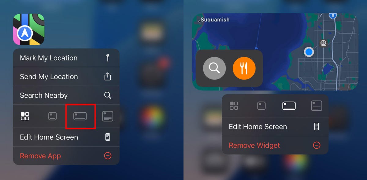
You can also quickly turn compatible apps into widgets that display more information. Maps, for instance, can be a map of your current location with shortcut buttons to search for places or bring up a list of nearby places (such as dinner spots). Touch and hold the app icon and look for a row of resize buttons in the menu that appears. Once expanded beyond the standard icon size, you can drag the handle in the bottom-right corner of the new icon. To get it back to its single icon size you need to touch and hold again and choose the single-icon button

Some apps can be expanded into larger icons that act like widgets.
Set Dark mode: If you’ve ever subjected yourself to the retina blast of black text on a white background late at night in a darkened room, you will appreciate the new Dark mode option for the home and lock screens. iOS has previously included a Dark mode, where light backgrounds switch to black or dark gray, text switches to white or light gray and other interface elements are dimmed to coexist in a dark environment. That’s never been applied to the home and lock screens in any significant way — only the dock and some widgets — until iOS 18.
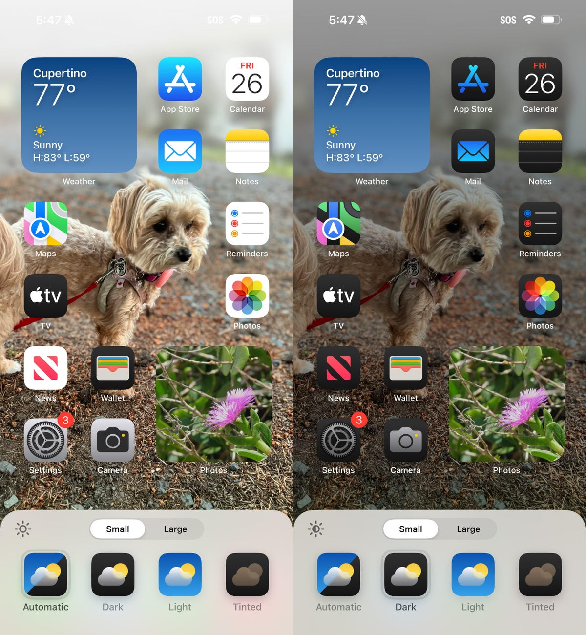
First, touch and hold the home screen to enter jiggle mode. Tap the Edit button in the top-left corner and choose Customize from the menu. At the bottom of the screen, choose a mode for the icons and background: Automatic, Dark or Light (I’ll get to Tinted in a moment). In Dark mode, the icons gain black backgrounds, and folders and the Dock become dark gray. (Developers have the option of making Dark mode icons for their apps. In the meantime, apps not yet optimized get a generally darker appearance.)

In the home screen’s Dark mode, icons and the background are given a darker treatment.
In Dark mode, the background image also changes. Apple’s default iOS 18 wallpaper dynamically changes from light to dark as the day progresses, or you can choose colors that offer both a light and dark option. If you use a photo, its overall exposure is reduced to dim the light output.
If you want dark icons but aren’t a fan of the dimmed photo treatment, tap the sun icon in the corner of the options sheet at the bottom of the screen to toggle back to Light mode just for the background.
Tinted icons: A new and different option is to tint all of the app icons so they share the same color. In the Customize options at the bottom of the screen, choose Tinted as the icon style. You can then adjust the Hue (the slider with the color spectrum) and Luminosity (the slider with the dark to light range) to choose the color tint you prefer.

Apply a universal tint to all app icons, with controls for adjusting the hue and luminosity.
What if you want to match a color from a background image? Tap the eyedropper button and then drag the reticle to pinpoint the color you want — the border indicates the selected color.
The tint is applied not only to icons but to widgets as well. For a widget such as Photos, the images it displays show up as duotones to match the theme.
Large icons: Do the labels below each app icon seem redundant to you? Now you can remove the labels and increase the size of the icons with one setting. Open the Customize options as described above and tap the Large button.

Make the home screen icons larger and hide the app labels.
After making any of these changes, tap anywhere on the screen to apply them and exit the Customize interface.
Change up how the Control Center looks
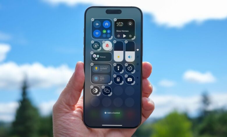
Control Center was once a convenient place to quickly access controls such as playback volume and Airplane mode, but under iOS 18 it’s a configurable playground. You can position controls where you want, resize many to reveal more information and add new controls on multiple screens.
Swipe down from the top-right corner to reveal Control Center (or swipe up from the bottom on the iPhone SE). To enter edit mode, touch and hold or press the + button at the top-left corner.
Just as with moving apps, drag a control to another slot on the screen to reposition it. Many of the controls also include a bottom-right handle that can resize the control — in most cases, it reveals the name of the control and its current status (such as Flashlight Off).

Rearrange the controls in Control Center and, for some, expand them to reveal more information (or just make the button a larger target for pressing).
Control Center also now spans multiple screens. Swipe up to view controls for media currently playing, Home controls for smart lights and appliances and a page dedicated to the communication options that appear when you long-press the Connectivity block containing Airplane Mode, Wi-Fi, Bluetooth, Cellular and others. Look closely and you’ll see that those screens are actually individual controls expanded to occupy the entire Control Center area.
You can rearrange the order of those screens by moving their controls. Suppose you want Home controls to be the first swipe instead of Now Playing: In the editing mode, drag the large Home control up to the previous screen (Now Playing will shift to the right to make room).

Some controls get their own screens, such as Home. Normally it’s on the third screen, but here it’s been moved to the second screen.
To remove controls, tap the – (minus) button that appears. You can also add other controls: Tap Add a Control and scroll through the available options ranging from starting a Screen Recording to a host of accessibility options.
Read more: Best iPhone 16 and iPhone 16 Pro cases
Lock or hide any of your sensitive apps
Our phones carry some of our most sensitive data, and yet it’s not uncommon to hand a phone to a friend to view photos or look up something online. That doesn’t mean they’re going to snoop, but it doesn’t not mean they might be more curious than you’re comfortable with. For data you want to ensure stays out of sight or to add a layer of protection in front of sensitive information, iOS 18 adds the ability to lock and hide apps.
For example, let’s say you keep an ongoing set of lists of gift ideas for family members in the Notes app. You can lock individual notes, but that requires a separate step. Maybe a few ideas were made as individual quick notes or drawings. Instead of micromanaging access, you can lock the entire Notes app by doing the following:
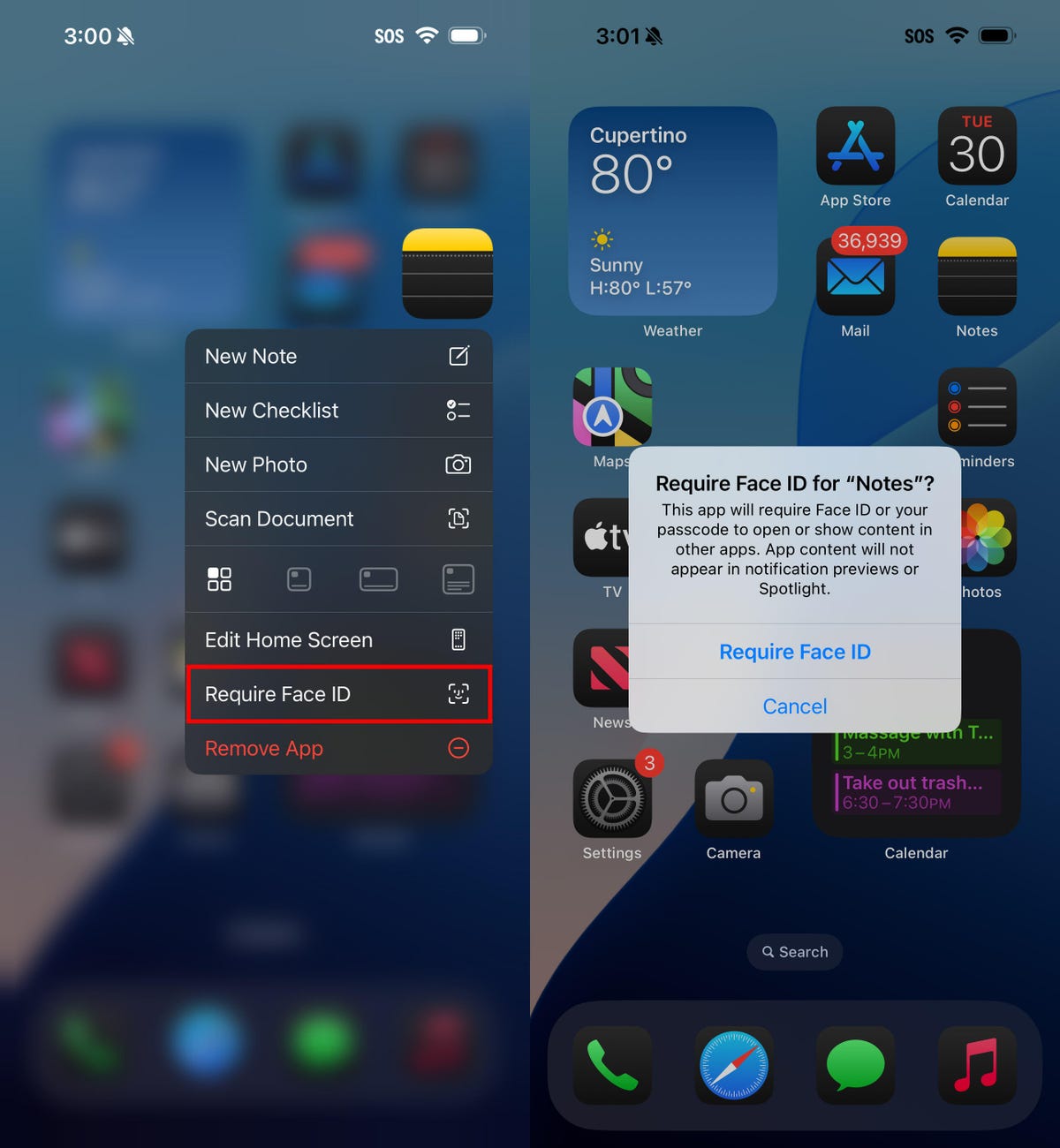
Touch and hold the app icon you want to lock and choose Require Face ID or Require Touch ID (or Require Passcode if Face ID or Touch ID are not enabled) from the menu that appears. Confirm your choice by tapping Require Face ID (or similar) in the next dialog.

Lock individual apps.
To remove the authentication step, touch and hold the app and choose Don’t Require Face ID (or similar).
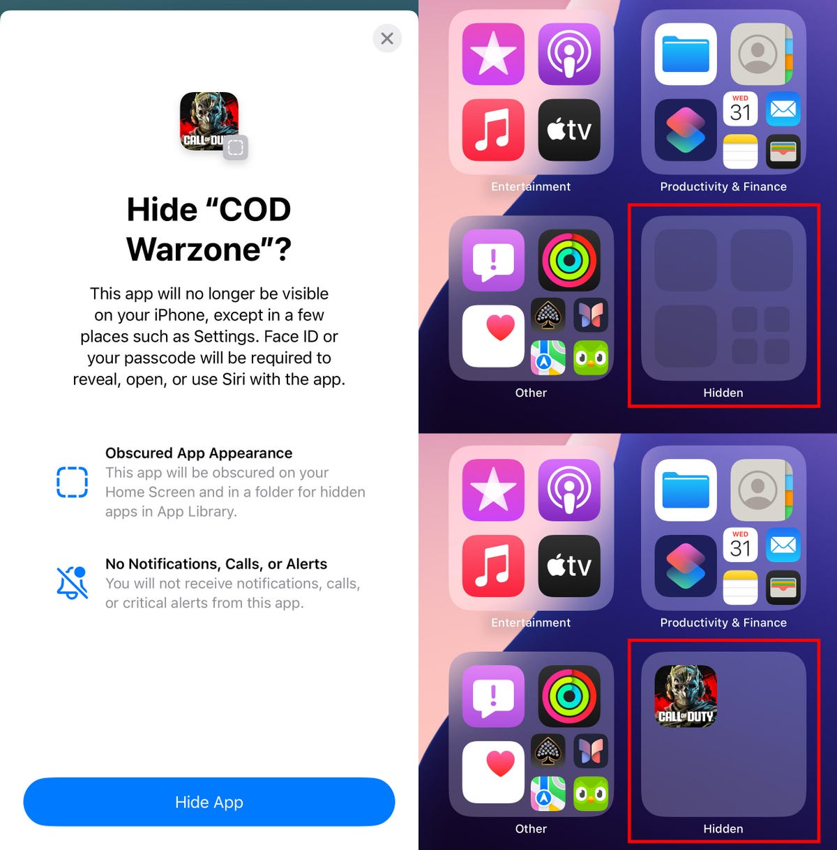
Nothing outwardly indicates that an app is locked — you’ll find out when you try to open it. There’s one more level of app security available, which is to hide apps in a special locked folder. Touch and hold the app and choose Require Face ID and then tap Hide and Require Face ID in the dialog. Confirm the action by tapping Hide App on the next screen.
The app disappears from the home screen and gets slotted into a Hidden folder at the bottom of the App Library (swipe left beyond your last home screen to view the App Library). To access apps there, tap the Hidden folder and authenticate with Face ID.

When you choose Hide and Require Face ID to protect an app, it gets put into the Hidden folder in App Library (top). Tap the folder and authenticate to access the app (bottom).
iOS 18 imposes some limitations on hidden apps. Some, such as many of the built-in ones like Notes or Reminders, can only be locked and cannot be hidden at all. Also, the Hidden folder locks itself when you launch an app or swipe away from the App Library.
Adjust the view of your calendar
Big new features like locking and hiding apps are great additions but so are the tiny changes that you encounter every day. The Calendar app includes two new ways to view your schedule.
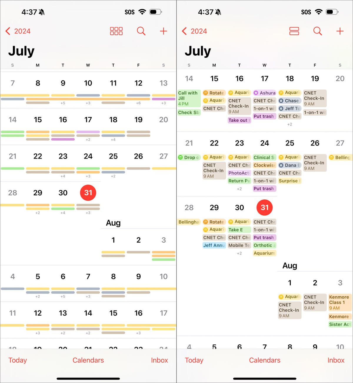
In iOS 18, when you’re in the Month view in portrait orientation, pinch with two fingers to view more or fewer details. As you “zoom in,” individual events appear as colored bars and then as labeled events with times, all while keeping the monthly grid of days and weeks.

In the Calendar app’s Month view, pinch to zoom in and see more details.
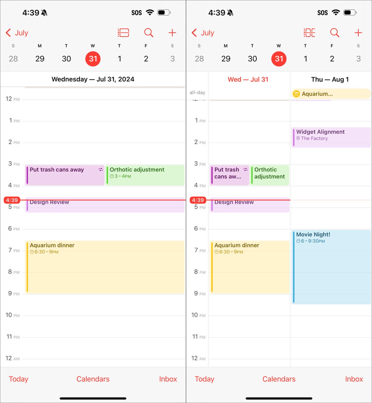
The Day view, which breaks down your day hour by hour, now has a new Multi Day view that shows two consecutive days to give you context for what’s coming without turning the phone into landscape orientation and viewing the Week view. Tap the View button at the top of the Single Day view and choose Multi Day from the popup menu.

The new Multi Day view in the Calendar shows two days at once (right).
Improve movie and TV show dialogue in the TV app
Trouble hearing dialogue in movies and television shows isn’t a new problem — for example, the Apple TV has had a feature for a while where you can ask Siri, “What did she say?” and it will automatically back up a few seconds, turn on subtitles and replay that section of the video. You can even buy soundbars that can overcome muffled TV speech. There are a lot of reasons it’s harder to hear dialogue, but the TV app in iOS 18 includes a high-tech workaround to make dialog easier to discern.
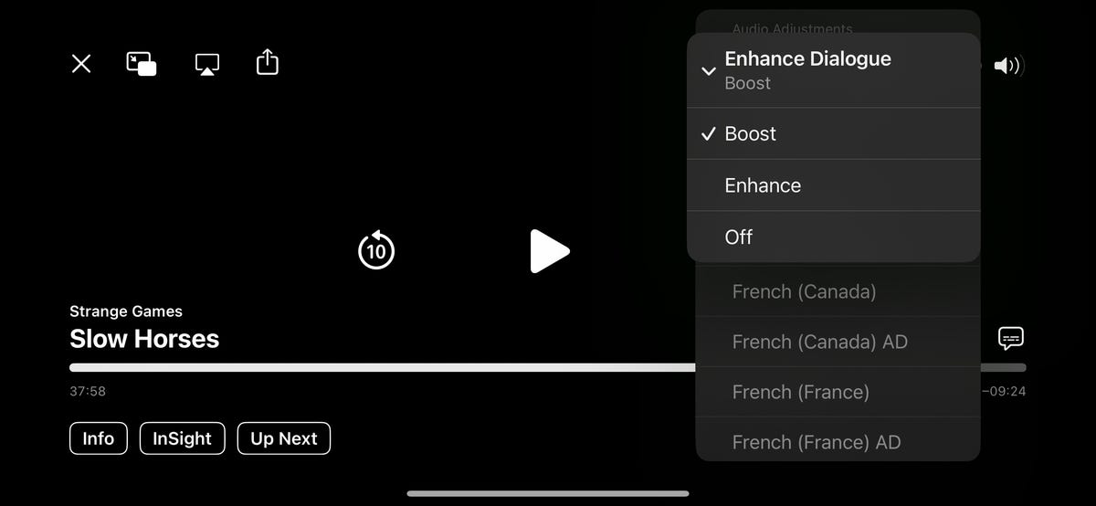
While you’re watching a video in the TV app, tap the More (…) button and then expand the Audio heading in the menu that appears; if the phone is in horizontal orientation, tap the Audio Adjustments button. Tap Enhance Dialogue and choose Enhance or Boost. They each dampen background noise and raise the dialogue’s audio.

Turn on Enhance Dialogue in the TV app to discern characters’ speech better in noisy scenes.
These are just a few new features and changes in iOS 18. Check out our broader coverage of Apple Intelligence, more impressions of the system after using it for months and how these will all work together with the upcoming iPhone 16 models.

