iOS 18 Review: New Customizations Made My iPhone Feel Tailored to Me


Whether you have a new iPhone 16 Pro or are holding onto an iPhone XR, you can download iOS 18 now. Apple released the operating system on Sept. 16, more than three months after the tech giant announced it at the company’s Worldwide Developers Conference this summer.
Read more: iOS 18 Brings These Features to Your iPhone
I started beta testing iOS 18 on my own iPhone XR after WWDC and then my iPhone 14 Pro in July when the public beta came out to see how the software works and feels in daily use.
What I found in my three months with the software was that it gives you more control over how your iPhone looks and functions and it adds helpful new features to apps like Messages and the Calculator. But for all the upgrades, the best thing about the update is it doesn’t force you or demand you use these new functions if you don’t want to. That means if you like the way you’ve used your iPhone for the past year, you can keep using it like that in iOS 18.
These changes made my iPhone feel more tailored to my needs, more useful and capable than before and made communicating with others easier and more enjoyable.
iOS 18 will work on the new iPhone 16 lineup and iPhones dating back to the second-gen SE, but some of the features won’t work on all phones. For example, Apple Intelligence features — while not included in the initial iOS 18 release — will only work on the iPhone 15 Pro and newer at launch. Smaller features, like widening your iPhone’s flashlight beam, are limited to models with the Dynamic Island, like the iPhone 14 Pro. Otherwise, most features and upgrades can be used on all iPhones dating back to the second-gen iPhone SE.
But enough preamble, let’s get into my thoughts on iOS 18 and what I hope to see in future iOS versions.
Customization is key to iOS 18

For many years, iPhone users have been stuck with certain design layouts and functions preselected and prearranged. The home screen, for example, could only be filled with apps top-to-bottom and from left to right. The app icons themselves couldn’t be changed unless you had the technical knowledge and patience to create a new Shortcut. The lock screen had a few functions bolted in place that you couldn’t alter, and the Control Center could only house a few specific controls.
That all changes with iOS 18.
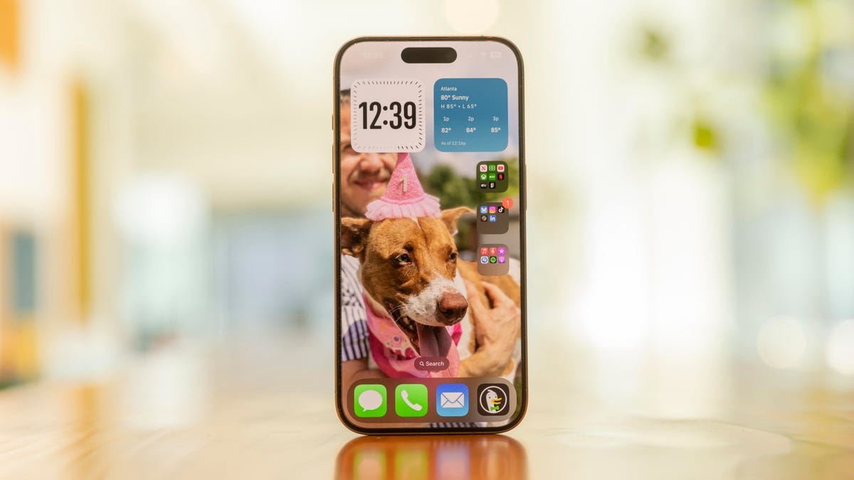
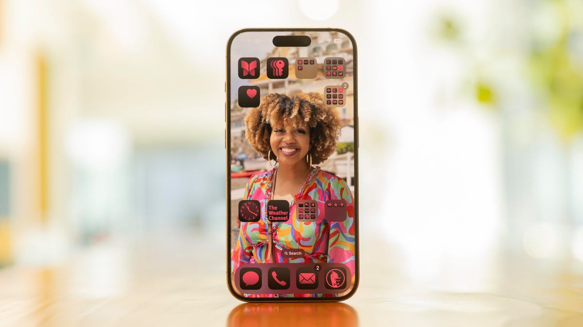
Customization is a major part of iOS 18 — with the update, you can make your iPhone truly your own. You can change the color of your app icons, you can arrange them around your home screen so they aren’t blocking your wallpaper and you can replace the controls on your lock screen with ones you’ll get more use out of. You can even remove the names of your app icons to give your iPhone a nice clean look — which is one of my favorite new changes.
iOS 18 also retools the Control Center in your iPhone so that you can add dozens of controls to the screen as opposed to the handful of controls in previous iOS versions. That means you can control certain smart home functions, iPhone functions and more in that menu.

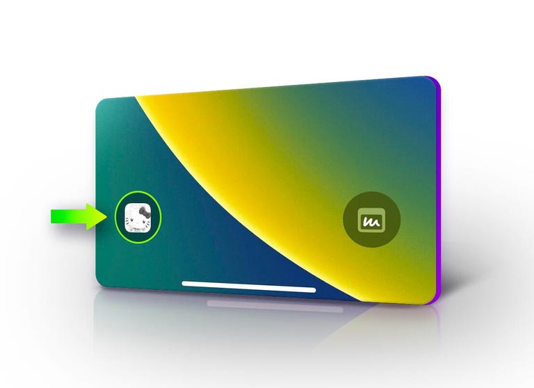
You can even place your favorite game on your lock screen for quick access.
While some of these options are focused on making your iPhone more aesthetically pleasing, these changes also give you the freedom to tailor your iPhone to your specific needs. For example, you can turn your Control Center into your central hub to access or change tools so you aren’t rifling through menus looking for the right button to turn off something like your VPN. You can even remove your flashlight from the lock screen so you aren’t accidentally turning it on whenever you pick up your phone. And with the Open App function, you can quickly access your favorite social media app, games and any other app from your Control Center or lock screen.
Overall, I like all of these customization options. Changing the color and size of my apps is mostly an aesthetic choice, but I’ve also arranged apps down the right-side of my screen for easier access since I’m right-handed. So now I can comfortably access all my apps without worrying I’ll drop my iPhone. I also like seeing my wife’s and dog’s faces in my wallpaper rather than have them peek out from behind Spotify.
These changes also help me use my iPhone in a more deliberate manner. I replaced the camera function on my lock screen with the Sports app now that football season is here. That way I can quickly check scores from across the NFL without getting distracted by other apps.
And like everything in iOS 18, if you like the way your iPhone looks and the way things are set up — or you’ve just gotten used to it by now — you can keep everything as it is. These changes are about what’s comfortable for you, not how Apple thinks you should use them.
Messaging your friends and family is fun again
Messages also gets a handful of upgrades in iOS 18 to make chatting with friends and family much more fun and worthwhile.
For starters, Messages now has RCS messaging. Rich Communication Service is a protocol that replaces Short Message Service and is similar in some ways to the messaging protocol already in place between iPhones. It has typing indicators, high-resolution media sharing and improved encryption over SMS — but it still lacks iMessage’s end-to-end encryption. All this means that your iPhone and your friend or family member’s Android device will play nice and better communicate with each other. It’ll almost be like you’re messaging another iPhone, but the green bubbles are still there — womp womp.

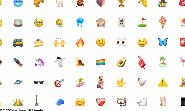
You can react to messages with any emoji now.
Next, Tapbacks — Apple’s version of Reactions — are more useful and potentially less confusing. Previously, you only had six Tapbacks: a heart, thumbs up or down, a “Haha,” exclamation points or a question mark. These could confuse or irritate some people, though. Now you have the whole range of emoji, as well as custom stickers, to use. So instead of using the thumbs up and potentially coming off as passive aggressive, you can use the 100 emoji or a sticker for even more personal flair.
With the upgraded Messages in iOS 18, you can also schedule messages to send later — something I’ve wanted for a while. I have family and friends in different time zones and who work weird shifts so I don’t want to be messaging them when they’re asleep. Being able to schedule a message to send to them is helpful for me, so I don’t feel like I’m waking someone up but I’m also not forgetting to message them about plans we have for that day or weekend.
Other upgrades allow you to use different text effects to make your message more expressive. Many of these new Messages features make texting feel a little more inclusive, fun and meaningful. When I use the new Tapbacks or text effects, I feel like I can express myself to others better because my feelings on something can be easier understood to others via text.
And while a lot of people are excited about RCS messaging coming to iPhones, I’m kind of ehh on the change. I didn’t really notice it throughout my time using the beta, and I don’t think I would have known about it if Apple didn’t include a small mention of the feature in their WWDC presentation. I’m happy it’s there though because now any pictures or videos sent from an Android device won’t look like they were shot on a Motorola Razr from 2010.
Other noteworthy changes in iOS 18
This OS is packed with other changes that don’t immediately make themselves known, but once you see them you’ll likely find them helpful.
One of my favorite things I found in iOS 18 was the upgraded Calculator app. And I hear you, it’s a calculator app, how exciting can it be? But hear me out: It can perform conversions, you can save Math Notes to it to use later and it can store a history of all your calculations for reference. It’s nerdy, but I really liked these upgrades, and it makes the Calculator feel more utilitarian and helpful in more situations, like traveling to another country and needing to convert currency on the fly.
The Notes app gets some helpful upgrades, too. First, it’s easier to organize your notes with collapsible sections, which keeps the app tidy, focused and easily searchable. Notes also gets a new audio transcription tool that can make note-taking in meetings, class lectures or anywhere else a thing of the past.

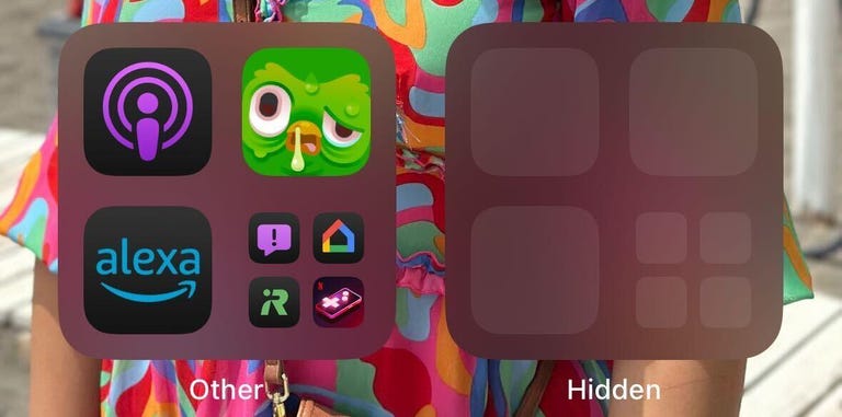
And there’s a useful new security feature that lets you lock and hide certain apps. I don’t have kids, but I’ve read stories online about children who get ahold of their parent’s phone and accidentally order thousands of dollars of items from an online store like Amazon, and I get a headache just thinking about that. With iOS 18, you can lock shopping apps behind a passcode — or better yet, hide them in the discreet Hidden folder — to keep your kids out of them so they don’t make a pricey mistake.
There are loads of other smaller upgrades iOS 18 brings to your iPhone as well, like T9 dialing and creating custom routes in Maps. And each of these upgrades enhances the usefulness of the app or feature without making you relearn how to use it all over again.
What we didn’t get with iOS 18
Most of the missing features from iOS 18 all have to do with Apple Intelligence. There’s no upgraded Siri, no Genmoji and no upgraded Mail app or other writing tools. However, this isn’t that surprising. Apple said at WWDC in June that these features would arrive on iPhones later this year, starting with the iPhone 15 Pro models and earlier. But we might not have to wait that much longer: Developers can access these features already with the iOS 18.1 developer beta.
What I didn’t like in iOS 18
Apple made a big deal about revamping the Photos app at WWDC, but I didn’t find it that impressive. Early in the beta phase, there was a carousel added to Photos that let you swipe through different categories, like videos and Favorites, but it was later removed — thankfully.
Even without the carousel, I’m still not into the app’s new look. Now in Photos, you can tap through sections like Recent Days, People & Pets and Pinned Collections to find a photo. But I don’t want to look through these, tap into a folder I think might have the photo I’m looking for only to be disappointed and have to back out of the collection and start the search all over again. I just want to look at all my photos at once and scroll through them until I find the one.
I never felt like I needed or wanted to use any of the tools in the new Photos app, which is fine because if you swipe down from the top of the app, you go back into the old view of Photos. So you don’t have to use the new Photos tools if you don’t want to. I know I won’t.

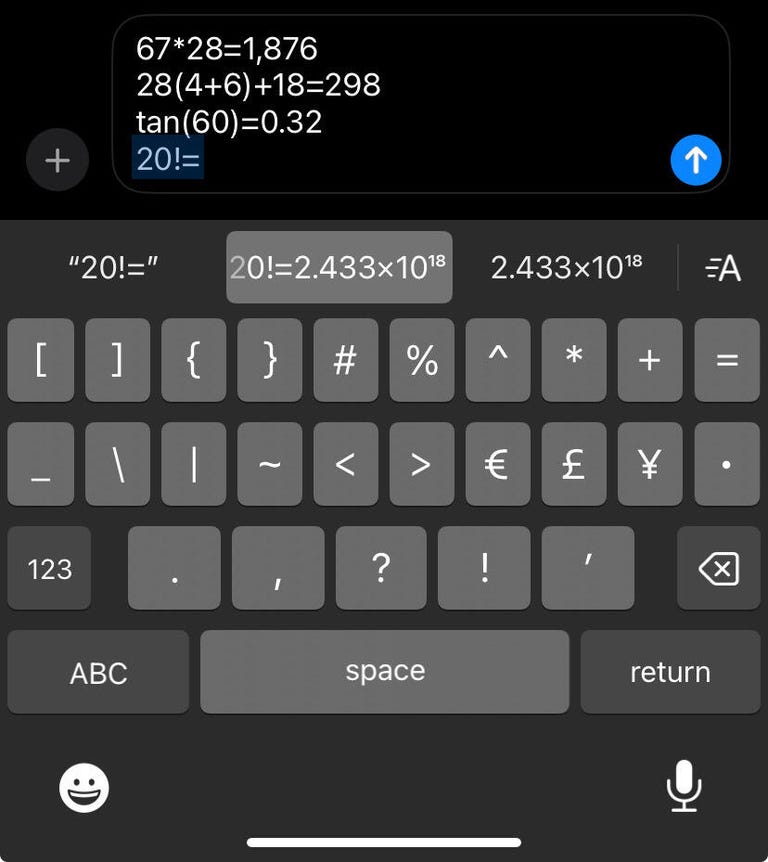
A math keyboard in Messages might make this feature easier to use.
And for all the fun new features in Messages, there’s one that doesn’t feel worth it and that’s doing math problems and conversions in the text field. It’s a fun feature when you notice it, but inputting the formula or conversion correctly and switching between multiple keyboards for numbers and math symbols feels pretty tedious. More often than not, I switched to Calculator if I needed to do any kind of math. This is a feature that I saw and thought, “Oh, neat!” but ultimately felt too difficult to use.
There’s also a smaller feature that lets you shoot video and play music in the background at the same time that I didn’t find that impressive. I feel like the intent was to make it easy to record a video with music and then post that video directly to social media without needing to edit it much, but the recorded sound isn’t great quality. Maybe this feature will work better on the iPhone 16 Pro since Apple said it has four-studio quality mics. This feature was on by default on my older model iPhones, which was annoying, but you can turn it off.
What I hope we get in future iOS versions
Please, Apple, show a little love to StandBy mode. I really like the new mode that Apple introduced with iOS 17 but since then it hasn’t changed much.
I’d like to change the font size of messages and alerts that come in so I can read them all the way through, and I’d also like to change the time between tapping alerts to read them and those alerts disappearing. I’d also like to see a Mail widget that lets me see the last few emails in my inbox so I can keep up with them. Slack made a third-party widget for StandBy mode already, so what’s taking Mail so long?
Final word on iOS 18
The latest iOS version doesn’t force you to learn how to use a new widget or a new mode in order to function. Instead, it improves on apps and functions you already know how to use without drastically altering them, and the update makes it easy for you to tailor your iPhone to your needs and desires — functionally and aesthetically. But if you like how your iPhone works already, then no worries. Apple is giving you the choice to use iOS 18 however you want.
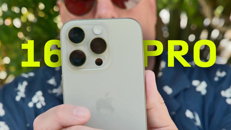
For more on Apple, here’s our iOS 18 cheat sheet and everything Apple announced at its iPhone 16 event. You can also check out what to know about the iPhone 16 and 16 Pro.

Watch this: Review: Apple’s iPhone 16 Pro Is an Impressive Upgrade


