Motorola Razr 2024 Review: A Fun, Practical Foldable That Doesn't Break the Bank







Pros
- Roomy, 3.6-inch cover screen
- Great battery life
- Affordable price
- Minimal crease in screen
- Fun features like live preview of images on external display
Cons
- Not a full-size cover screen
- Some apps not compatible with cover screen
- Camera features like portrait and night mode are hit-or-miss
- Only three years of OS updates
Until two weeks ago, I largely dismissed foldable phones as gimmicky and overpriced. What was the point of a clamshell-style device in 2024, besides flexing next-gen display tech while tapping into nostalgia — all at an exorbitant price?
But that was before I spent a week and a half with the Motorola Razr. This year’s model, which was released in July, is an innovative, $700 gadget that proves foldables don’t have to be cost prohibitive. Thanks in large part to a bigger external display than last year’s iteration — aided by an impressive camera and stellar battery life — it’s a highly practical phone that doubles as my new favorite party trick.
Foldables have been vying for our attention (and dollars) for years, with notable releases like the Samsung Galaxy Z Fold and Flip and the Google Pixel Fold. But these phones aren’t very budget-friendly, with the clamshell-style Z Flip 6 ringing in at $1,100, and the book-style Z Fold 6 and Pixel Fold costing $1,900 and $1,800, respectively. Motorola’s revival of the beloved Razr line in 2019 also came with a hefty $1,500 price tag at the time, though the company has managed to bring down the price of its standard Razr to $700 and the Razr Plus to $1,000.
Aside from cost, another deterrent is that phones with foldable displays don’t always have a clear use case. The 2024 Motorola Razr helps to address some of those lingering reservations that I, too, had, but it’s by no means a perfect device; the front display doesn’t fully accommodate all apps, for instance, and there’s still a fairly noticeable crease on the inside. But I’m impressed with just how normal this foldable feels when it’s opened and how many functions there are for the cover screen, like seeing a preview of selfies or texting without having to flip open the device. And the spacious internal display is great for features like split screen mode, which lets you view and use two apps simultaneously, and for watching videos on a roomy display — which conveniently folds up when you’re on the go.
It’s those little things that go a long way in demonstrating why a foldable — and a Razr — comeback may be worthwhile.
A much-needed bigger cover screen

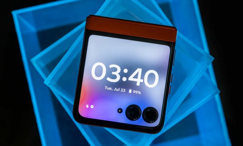
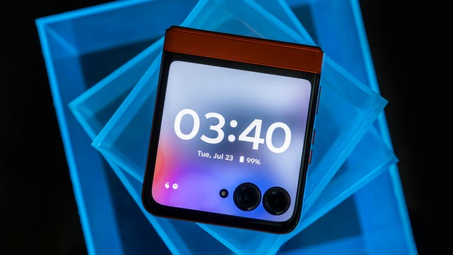
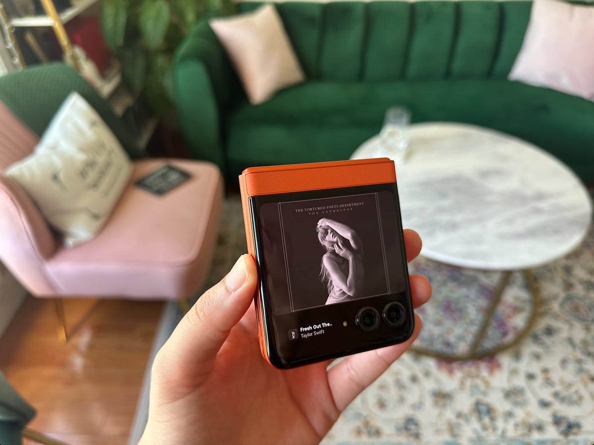
The 3.6-inch screen on this year’s Razr is a huge selling point.
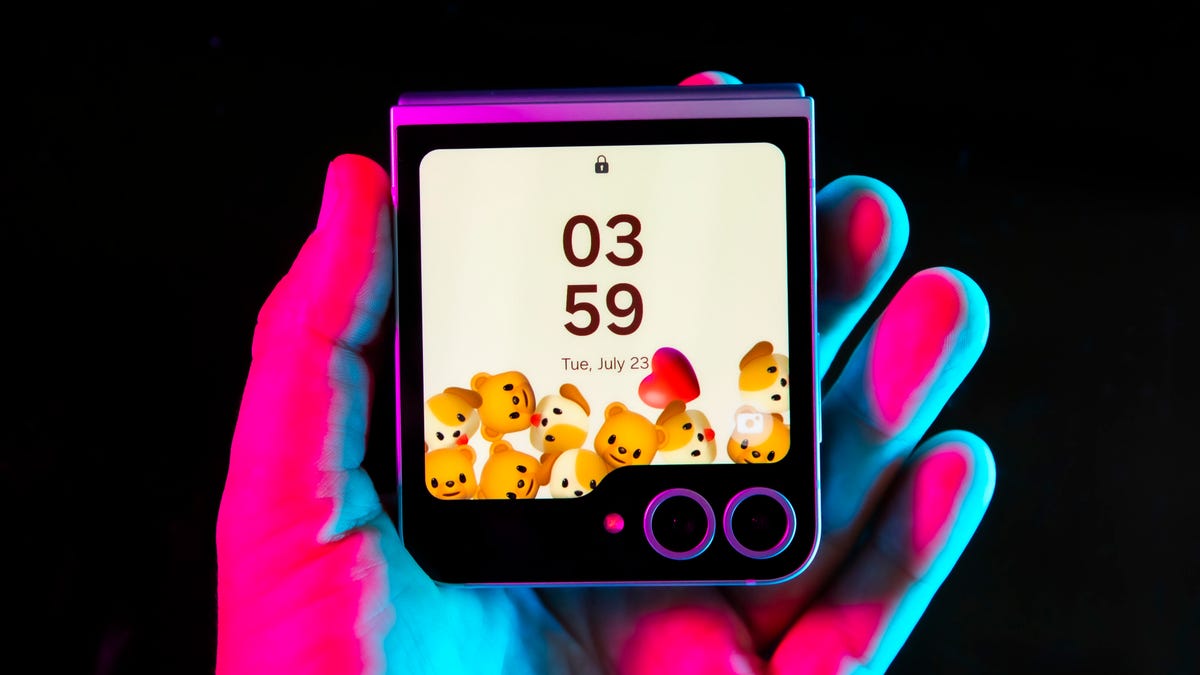
This year’s Razr amends one major drawback from previous models: the cover screen. While the 2023 version had a tiny 1.5-inch display to swipe through apps and widgets like your calendar, contacts and media, this year’s release features almost a full, 3.6-inch OLED display — essentially the same one from the 2023 Motorola Razr Plus. (If you don’t want that half-inch bezel at the top, you’ll need to upgrade to the Razr Plus, which I think is a bummer — but they’ve gotta tempt you to pay up somehow.) That makes the Razr’s cover screen larger than the 3.4-inch external display on the Galaxy Z Flip 6 — which also dedicates much of that precious real estate to the file folder tab cutout housing the cameras.
Because the main and external displays share the same 413 ppi pixel density, switching between the two screens to view content doesn’t feel like a compromise in image quality.
I found myself using the Razr’s cover screen for almost everything, including texting, taking photos and listening to music. In fact, the controls for YouTube Music (yes, I use YouTube Music) were reminiscent of the 6th generation iPod Nano, with its cute square display and touchscreen controls. It was fun to take that walk down memory lane.

One of my favorite features was listening to music on the cover screen; the controls reminded me of the 6th gen iPod Nano.
The cover screen is just big enough to make texting not feel awkward, though you won’t see more than a sliver of your previous messages when the keyboard is pulled up. A full-screen mode slightly expands the text box so you can see more of what you’re typing. But if you want to be able to refer to your text chain more easily, it’s best to just pivot to the internal display.
I had to test out my favorite app on the cover screen: TikTok. How would vertical videos appear on this smaller, square-shaped display? To my surprise, browsing this way didn’t compromise the experience too much — I could still easily scroll and tap like, comment or share. Still, content has to be cropped, and sometimes awkwardly; you may only see half of someone’s head, for instance. Other times, you may not see the full scope of a beautiful beach sunset in someone’s video.
Browsing through Instagram was a bit more challenging. You won’t see a full image without scrolling, and Reels are awkwardly cropped. Expanding a Reel to full-screen mode will make it slightly bigger, but you still won’t see the entire video or even be able to access the like button, which doesn’t fit onto the cramped display. So, when it comes to social media apps, I found myself opting for the much larger and more natural-feeling 6.9-inch internal display instead. (It’s worth noting that it’s largely up to app developers to adapt their platforms for a smaller display.)
Now, let’s jump into what I think is the most impressive and practical use of the cover screen: the camera.
The Razr’s cameras making taking photos a snap

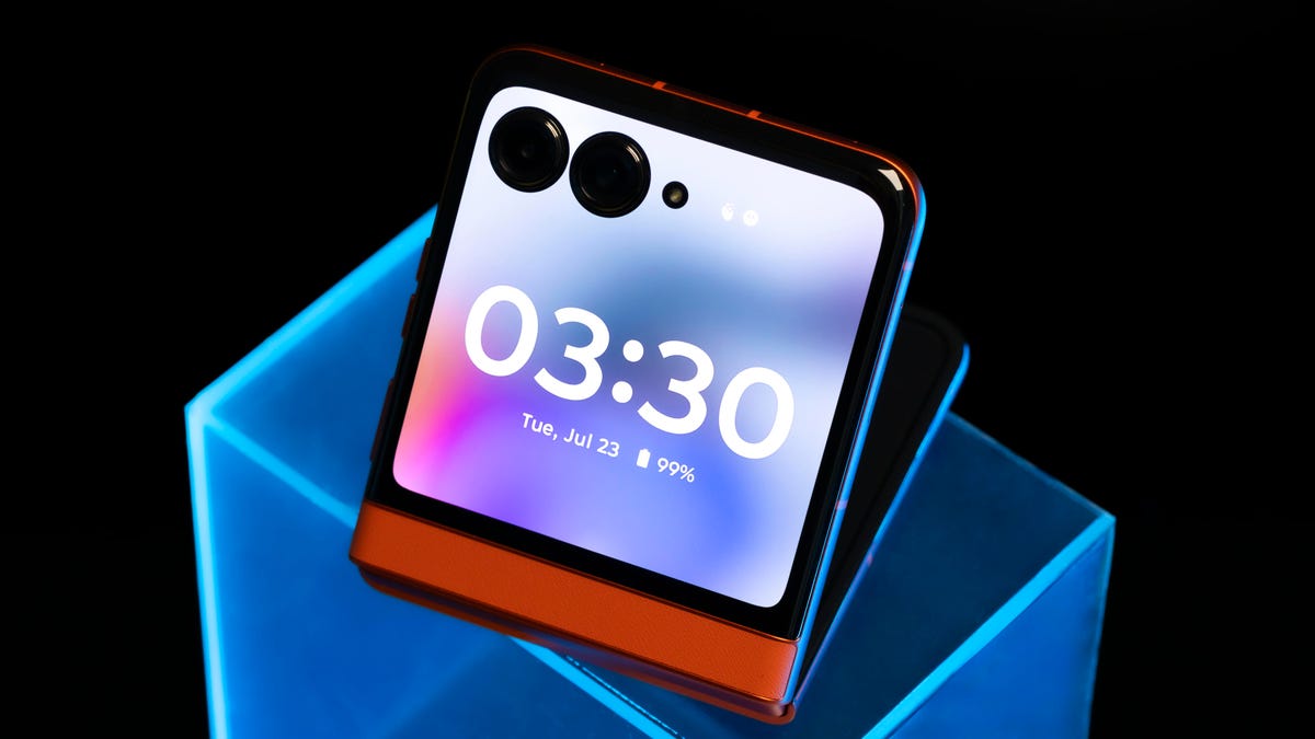
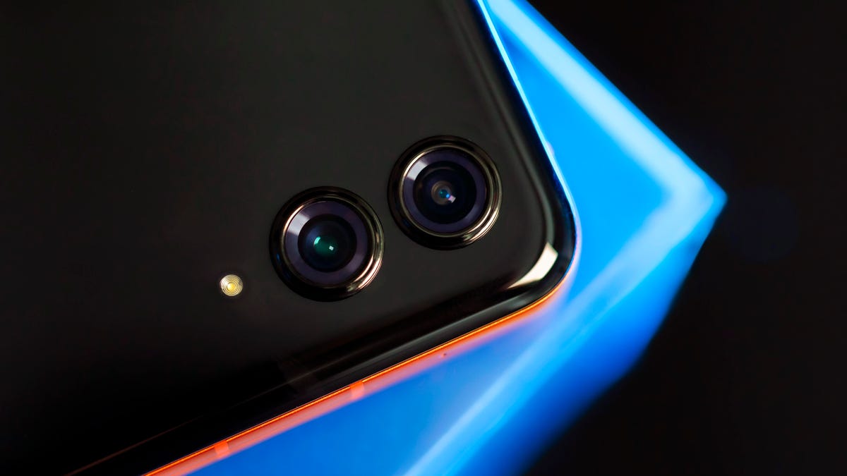
The Razr has a wide and ultrawide camera on the cover screen.
The Razr sports a 32-megapixel selfie camera on the internal display, as well as a new 50-megapixel main camera (the same one found on the 2024 Razr Plus) and 13-megapixel ultrawide camera on the back.
I loved being able to take shots with the rear cameras while the phone was folded shut. Launching the camera app using the cover screen is a great way to quickly snap a selfie. Standard mode photos are sharp, but images do tend to be slightly more shadow-y, and you’ll have to make do with awkward 1:1 or 3:4 aspect ratios, versus a more standard 2:3 ratio. If you want horizontal or vertical images in more standard dimensions, you’ll need to open the phone and use the rear cameras.

This shot I took with fellow CNET-er Faith Chihil is one of my favorites because it’s crisp, well-lit and the colors are punchy.
Portrait mode via the cover screen does a good job of focusing on the foreground, even when there are two people in the photo, though it can struggle a bit with blurring edges around people. For instance, a selfie of me and my colleague Jessica Fierro shows some patches around our heads where the bokeh effect isn’t perfect.

Notice the patchy areas around me and Jessica, where portrait mode struggled with what to blur.
You can also flip the phone open and still take selfies using the rear cameras and get a preview on the cover screen by enabling the External Display Preview mode in the camera settings. This was my go-to party trick: taking pictures of people and then having them squeal with excitement when they could see the image I was capturing via the external display.

CNET’s Patrick Holland and Faith Chihil showing great enthusiasm while seeing a live preview of this image via the Razr’s cover screen.
The Razr also packs signature Motorola features like gesture selfie, which automatically snaps your photo after you show your palm, and auto smile capture, which takes a picture when everyone in the frame is smiling. I found both features were hit-or-miss; while they worked most of the time, there were instances where gesture selfie wouldn’t trigger the camera, and while auto smile capture seemed to work consistently, it’s a little too responsive. I prefer to just have someone tap the shutter button, so you don’t end up with 10 of the same photo. But it is nice to at least have those options.
Bonus Moto feature of note: You can twist your wrist twice quickly to open the rear camera. Bonus bonus Moto feature of note: If you have a Moto Tag, the button doubles as a remote shutter button for the cameras.

Here’s how a shot on the Razr’s internal selfie camera came out: colors are punchy and everyone’s in clear focus.
I’m perhaps most impressed by portrait mode on the rear camera, when you flip the phone open. Photos of people are clear, with punchy colors and contrast, and you get a more standard aspect ratio. Images I snapped of Jessica in the office, for instance, don’t struggle with what to blur, and she stands nice and crisp in the foreground.

Opening up the phone and then taking a portrait mode shot tends to fare better than using the cover screen.
I also used portrait mode to take my signature teaware pictures (follow @alheetea for more), and I was so impressed by one shot that I immediately posted it to Instagram. I appreciate how bold the blues of the teacup and dessert plate are and the amount of detail in the scone. Despite everything being in clear focus, there’s a subtle smoothness across the whole image, softening it just enough so that there are no harsh shadows or stark highlights, giving it an artsy glow.

It’s not an Abrar review without a shot of a teacup. This portrait mode image was one of my favorites.
I tested out the .5x, 1x and 2x optical zoom levels at my go-to photo spot, Filoli Gardens in Woodside, California, by snapping pictures of blooming hydrangeas. All images are well-lit, and the .5x image does a great job of capturing the overall scene without weirdly warping the edges too much. Similarly, the .2x zoom photo doesn’t seem unnaturally punched in. That’s because when the camera isn’t zoomed in, the 50-megapixel sensor combines four pixels into a single large one to make a brighter 12.6-megapixel image, with better details and less image noise. The Razr can also take hi-res 2x photos without digitally zooming in, instead achieving that cropped look by using a 12.6-megapixel portion of the sensor.
I also tested out the 10x digital zoom, and that didn’t hold up as well; the image is a bit fuzzy in both the foreground and background. But that’s largely to be expected with digital zoom, especially on a foldable phone where there’s less room for larger sensors and lenses.

An image of hydrangeas shot in .5x zoom.

Hydrangeas shot in 1x zoom.

Hydrangeas in 2x zoom.

And lastly, hydrangeas shot at 10x digital zoom. You can see the image isn’t very clear.
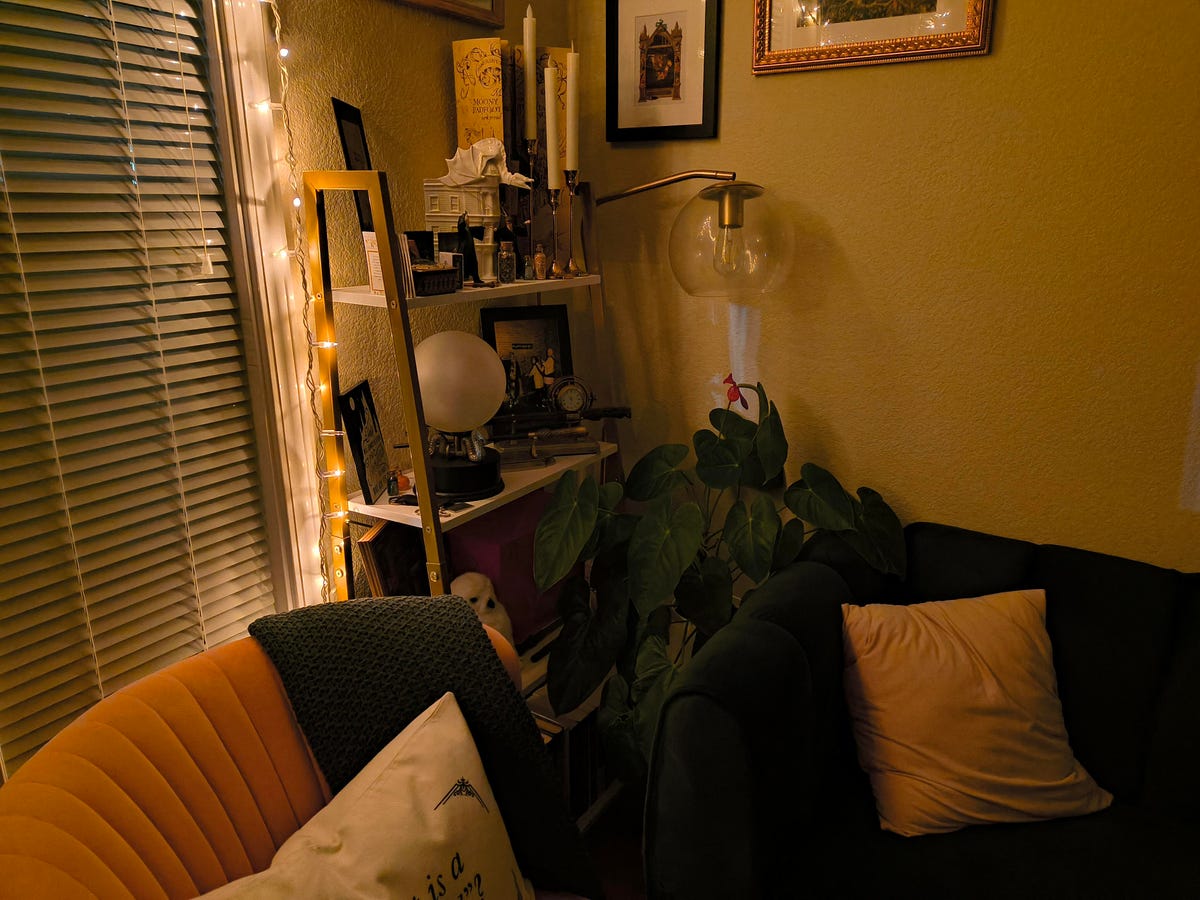
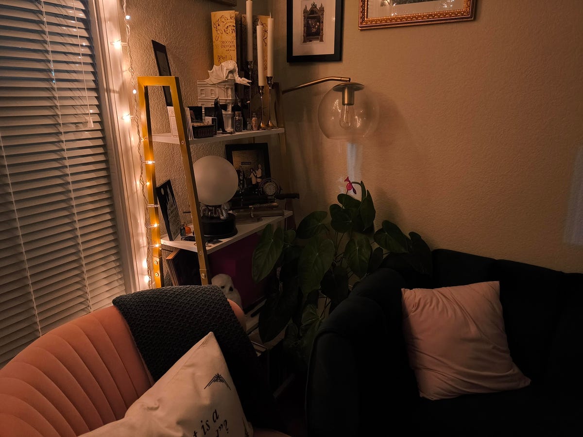
Night mode is decent but not great. I took two shots in my living room at night, with string lights being the only source of light: one a standard shot and the other using night mode. The night mode shot helped to remove the dark, orange-y overcast seen in the standard photo and reduced some shadows. But it didn’t do much to light up the image altogether.

This image, shot at night in my living room, has an orange-y hue throughout.

Motorola’s night vision helps to remove some of that orange tint, but it doesn’t do much to light up the overall shot.
Overall, shots on the Razr are somewhat similar to those taken on Samsung Galaxy phones, in that they’re relatively more saturated and feature a punchier contrast when compared to images taken on an iPhone, for example. This can help colors pop and prevent the shadows that I’ve noticed plague some iPhone photos, but it really comes down to preference. I tend to like images with a hint of saturation, as long as it’s not overblown. Thankfully, on the Razr, it’s usually not.
Videos recorded on the Razr are similarly punchy, though sometimes the colors are overblown. The phone features a 4K UHD camera that captures video at 30 frames per second, as well as an FHD camera that can shoot at 30 and 60 frames per second. Footage I took one afternoon at Filoli Gardens captured the various, deep shades of green of the lawn, trees and surrounding hills, as well as the pops of orange and purple across the landscape. But there’s also an intense contrast between the brightly lit patches of grass and pavement and the darker vegetation. Overall though, the videos did a decent job of capturing the lush landscape.
There’s a camcorder mode that’s designed to tap even further into nostalgia by letting you fold your phone at a 90-degree angle and shoot video with the rear cameras (Samsung also played up this feature when it unveiled the Galaxy Z Flip 6 during Unpacked in July). While it’s a cute idea, I’m not sure how useful it is. It’s not difficult to hold the Razr when it’s fully unfolded and just tap the record button, then proceed as usual. But again, at least you have the option if you wanna look ~unique~ and draw some curious looks from bystanders.

Watch this: First Look: The 2024 Motorola Razr and Razr Plus Come With Colorful Upgrades
The Razr’s crease is less noticeable
That leads to another point I was curious about: How would it feel to use the Razr when unfolded? Would it seem awkward and lanky?
Thankfully, the answer is no. As I’ve mentioned in a previous review, I don’t have the smallest hands, per say, but I found I was able to access all parts of the 6.9-inch internal display pretty easily. (For context, when opened, the Razr is about as tall as the Galaxy S24 Ultra.) The Razr sports an FHD plus pOLED internal display.
Apps like TikTok and Instagram also didn’t feel awkward or over exaggerated on the tall screen. They filled the display in a way that felt so natural I’d often forget I wasn’t just scrolling on my iPhone. Watching videos in full-screen mode on YouTube does conjure up larger black borders around content, to help fill in the extra space. I didn’t mind it, but if you’re adamant about a truly full-screen experience on YouTube without having to zoom in to fill the screen, it’s worth considering.
And now for perhaps the most pressing question: how bad is the crease in the internal display?
I’m happy to report I hardly noticed the crease when using the phone as usual. I couldn’t really see it at all when watching videos or scrolling through photos and apps. The only time you’ll really see it is when the screen is off. Otherwise, it mostly fades into the background. The crease on last year’s Razr also wasn’t super noticeable, but Motorola’s new hinge design minimizes it even more on this year’s model.
There’s also no noticeable hinge gap when the phone is closed, which has been a consistent pro for the Razr over the years. It’s inevitable that over time, there will be wear and tear on any phone that you open and close repeatedly. But out of the box, the 2024 Razr feels nice and smooth as it’s open and shut, even more so than last year’s model.

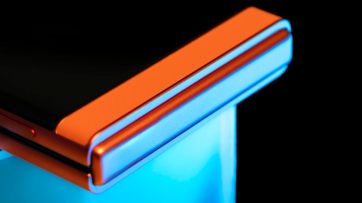
Motorola’s new hinge design helps to minimize the crease on the internal display.
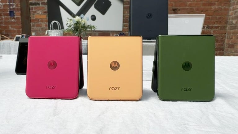
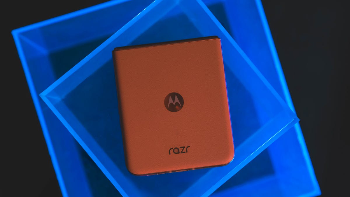
The phone comes in Spritz Orange (the color I tested), Beach Sand and Koala Grey. It features a vegan leather back that helps with gripping this uniquely-shaped device and flipping it open (which is still pretty hard to do one-handed).
The fingerprint reader built into the side button works without hiccups, as does the face unlock feature — which isn’t as secure when it comes to being able to use Google Pay. There’s no headphone jack; it seems the Razr doesn’t want to be that retro.
Razr battery life and performance

The animated wallpaper on the Razr’s cover screen.
Another impressive feat is the Razr’s battery life. It can last over a day and a half on my regular (admittedly heavy) use. I placed calls, sent texts, scrolled through social media and streamed videos, and it held up quite well.
In CNET’s 45-minute endurance test, which involves a combination of streaming, scrolling through social media, joining a video call and playing games, the battery only dropped to 97% — though it’s worth noting I’ve anecdotally observed that while that initial drop from 100% seems to take some time, the battery depletes a bit more quickly (albeit still totally normally) after that.
In a longer, three-hour streaming test over Wi-Fi, in which I watched a YouTube video in full-screen mode on the internal display, the Razr’s battery stayed at 100% after one hour, dropped to 96% after two hours and landed at 91% after three hours. For comparison, the 2024 Razr Plus dropped to 84% in the same test, and the Galaxy Z Flip 6 reached 81% (both phones have smaller batteries and more power-hungry processors).
The Razr packs a MediaTek Dimensity 7300X chip, which is power efficient and helps to explain the phone’s impressive battery life — especially over last year’s Razr, which dropped to 91% after CNET’s 45-minute endurance test (that phone features a Snapdragon 7 Gen 1 processor, which has its own perks when it comes to raw performance, for instance). The Razr runs Android 14 out of the box and has 8GB of RAM and 256GB of internal storage. No expandable memory here. Motorola pledges three years of major OS updates, which is decent but far less than the seven years Samsung offers on its Galaxy Z Flip 6.

Another flex for the 2024 Razr: fast charging and long-lasting battery life.
A 30-watt charger (not included) will take the Razr from 0% to 58% battery in 30 minutes. (You’ll reach a full charge in just over an hour.) The phone also supports 15-watt wireless charging.
Benchmark tests for the CPU in Geekbench 6 place the phone below the Galaxy Z Flip 6 and the Motorola Razr Plus. In a graphics test using 3D Mark’s Wild Life Extreme, the Razr matches the performance of the Razr Plus, though it falls behind the Z Flip 6. Check out the graphs below for more specifics.
Geekbench v.6.0
Motorola Razr (2024) 1,040 2,956Motorola Razr (2023) 1,057 3,063Motorola Razr Plus (2024) 1,958 4,925Samsung Galaxy Z Flip 6 2,237 6,777
3DMark Wild Life Extreme
Motorola Razr (2024) 3,095Motorola Razr (2023) 830Motorola Razr Plus (2024) 3,059Samsung Galaxy Z Flip 6 4,290
3DMark Wild Life Extreme — Average frame rate
Motorola Razr (2024) 18.54Motorola Razr (2023) 4.98Motorola Razr Plus (2024) 18.32Samsung Galaxy Z Flip 6 25.69
I personally didn’t notice any major issues with the phone’s performance, though there was slight lag when it came to functions like automatically transferring the camera from the cover screen to the internal screen when opening the phone. Otherwise, apps launched quickly, the phone unlocked without lag and YouTube videos transitioned between portrait and landscape modes when the phone was rotated without any glaring delays.
Split screen mode, which lets you run two apps simultaneously, is a handy feature with such a large internal display. I was able to have YouTube playing on one half while texting on the other, for instance, and it didn’t feel cramped. I also appreciate being able to adjust how big each screen is, if you want to give one app more real estate, and that this feature works in both portrait and landscape modes. It is worth noting that you won’t be able to use all apps in split screen mode. Netflix, for instance, isn’t compatible.
The phone has an IPX8 rating, meaning it can handle being submerged in 1.5 meters of water for up to 30 minutes. That puts it on par with the Galaxy Z Flip 6’s water resistance, though that device is rated IP48 for dust resistance; the 4 refers to being able to withstand ingress for particles 1-millimeter or larger, so things like sand and dust could still be an issue. For reference, last year’s Razr sported an IP52 rating.
Motorola Razr 2024 overall thoughts

The 2024 Razr has a vegan leather back, which feels nice and helps with gripping the curiously shaped device.
The biggest selling point of this year’s Razr is that larger, 3.6-inch cover screen. I quickly grew accustomed to using it for tasks like snapping a selfie and responding to texts, or glancing at Google Maps in a more compact – albeit still totally useful – format. Motorola will need to find ways to better accommodate apps like Instagram and TikTok, for instance, but it feels like it’s headed in the right direction. I do wish the external display covered the full front of the phone when folded, and it’s a huge downside that you’ll have to pay $300 more to get that experience with the Razr Plus. But, hey, it’s progress.
The phone’s battery life continued to impress me throughout the time I used it, in spite of my daily rituals of endlessly scrolling through TikTok, Instagram and YouTube – plus how often I dramatically flipped the device open and closed throughout the day, which I can confirm is quite fun to do.
When it comes to the internal display, I’m pleased with how the crease, which is fairly noticeable when the screen is blank, essentially disappears once you launch just about any app. In time, it’s sure to become more undetectable, but it’s not much of a deterrent as it currently stands, either.
And finally, perhaps one of the biggest selling points: that $700 price tag. Making a foldable phone that costs well under $1,000, without compromising much in the way of quality or user experience, is a breath of fresh air. The Razr’s camera may not be as impressive as that on the Galaxy Z Flip 6, for instance, but it certainly does the trick, especially for posting to social media. And despite the Razr ranking lower in performance benchmarks than its competitors, I didn’t notice any gaping holes in the overall experience. It’s clear Motorola prioritized battery life over pure raw horsepower.
In short, the 2024 Razr proves you don’t have to break the bank to flip for a foldable. That sounds like a pretty sweet deal to me.
How we test phones
Every phone tested by CNET’s reviews team was actually used in the real world. We test a phone’s features, play games and take photos. We examine the display to see if it’s bright, sharp and vibrant. We analyze the design and build to see how it is to hold and whether it has an IP-rating for water resistance. We push the processor’s performance to the extremes using standardized benchmark tools like GeekBench and 3DMark, along with our own anecdotal observations navigating the interface, recording high-resolution videos and playing graphically intense games at high refresh rates.
All the cameras are tested in a variety of conditions from bright sunlight to dark indoor scenes. We try out special features like night mode and portrait mode and compare our findings against similarly priced competing phones. We also check out the battery life by using it daily as well as running a series of battery drain tests.
We take into account additional features like support for 5G, satellite connectivity, fingerprint and face sensors, stylus support, fast charging speeds and foldable displays, among others that can be useful. We balance all of this against the price to give you the verdict on whether that phone, whatever price it is, actually represents good value. While these tests may not always be reflected in CNET’s initial review, we conduct follow-up and long-term testing in most circumstances.
Motorola Razr 2024 vs Razr 2023 vs Razr Plus 2024 vs Samsung Galaxy Z Flip 6
| Motorola Razr (2024) | Motorola Razr (2023) | Motorola Razr Plus (2024) | Samsung Galaxy Z Flip 6 | |
| Cover display size, tech, resolution, refresh rate | 3.6-inch, pOLED; 1056 x 1066 pixels; up to 90Hz variable refresh rate | 1.5-inch, OLED; 194 x 368 pixels; up to 60Hz variable refresh rate | 4-inch pOLED; 1,272 x 1,080 pixels; 1-165Hz variable refresh rate | 3.4-inch AMOLED; 720 x 748 pixels; 60Hz refresh rate |
| Internal display size, tech, resolution, refresh rate | 6.9-inch pOLED; 2640 x 1080 pixels; up to 120Hz variable refresh rate | 6.9-inch pOLED; 2,640 x 1,080 pixels; up to 144Hz variable refresh rate | 6.9-inch pOLED; 2,640 x 1,080 pixels, 1-165Hz variable refresh rate | 6.7-inch AMOLED; 2,640 x 1,080 pixels; 1-120Hz refresh rate |
| Pixel density | Cover: 413ppi; Internal: 413ppi | Cover: 282 ppi, internal: 413 ppi | Cover: 417 ppi; Internal: 413 ppi | Cover: 306 ppi; Internal: 425 ppi |
| Dimensions (inches) | Open: 2.91 x 6.74 x 0.29 in Closed: 2.91 x 3.47 x 0.62 in | Open: 2.91 x 6.73 x 0.29 in; closed: 2.91 x 3.47 x 0.62 in | Open: 6.75 x 2.91 x 0.28 in Closed: 3.47 x 2.91 x 0.6 in | Open: 6.5 x 2.83 x 0.27 in Closed: 3.35 x 2.83 x 0.59 in |
| Dimensions (millimeters) | Open: 73.99 x 171.30 x 7.25mm Closed: 73.99 x 88.08 x 15.85mm | Open: 73.95 x 170.82 x 7.35 mm; closed: 73.95 x 88.24 x 15.8 mm | Open: 171.42 x 74 x 7.09mm Closed: 88.09 x 74 x 15.32mm | Open: 165.1 x 71.9 x 6.9mm Closed: 85.1 x 71.9 x 14.9mm |
| Weight (grams, ounces) | 188g (6.63 oz) | 189 g (6.65 oz) | 189g (6.67 oz) | 187g (6.6 oz) |
| Mobile software | Android 14 | Android 13 | Android 14 | Android 14 |
| Cameras | 50-megapixel (wide), 13-megapixel (ultrawide) | 64-megapixel (wide), 13-megapixel (ultrawide) | 50-megapixel (wide) 50-mexapixel (2x telephoto) | 50-megapixel (wide), 12-megapixel (ultrawide) |
| Internal screen camera | 32-megapixel | 32-megapixel | 32-megapixel | 10-megapixel |
| Video capture | 4K | 4K | 4K | 4K |
| Processor | MediaTek Dimensity 7300X | Snapdragon 7 Gen 1 | Snapdragon 8S Gen 3 | Snapdragon 8 Gen 3 |
| RAM/storage | 8GB + 128GB | 8GB + 128GB | 12GB + 256GB | 12GB + 256GB, 512GB |
| Expandable storage | None | None | None | None |
| Battery | 4,200 mAh | 4,200 mAh | 4,000 mAh | 4,000 mAh |
| Fingerprint sensor | Side | Side | Side | Side |
| Connector | USB-C | USB-C | USB-C | USB-C |
| Headphone jack | None | None | None | None |
| Special features | IPX8, 5G-enabled, foldable display, 30W wired charging, 15W wireless charging, 2x optical zoom, Moto gestures, Moto AI | IP52, 5G-enabled, foldable display, 30W wired charging, 5W wireless charging | IPX8 rating, 45W wired charging (charging brick sold separately), 15W wireless charging, 5W reverse charging, 2x optical zoom, Moto gestures, Moto AI | IP48 rating, 25W wired charging, wireless charging + powershare, 3x optical zoom (up to 10x digital and 30x Space Zoom with AI Super Resolution tech) |
| US price starts at | $699 | $699 | $1,000 | $1,100 (256GB) |


