The best cheap smart ring just got a major AI upgrade thanks to the RingConn app makeover
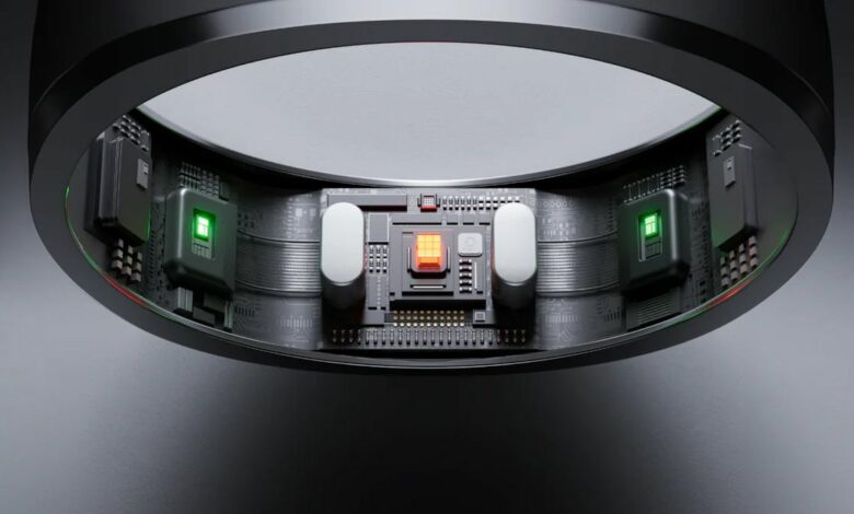
- RingConn’s app has received an overhaul
- It has new AI tools and a better look
- The AI chatbot is bland
RingConn has published an overhaul of its smart ring app, giving it a new coat of paint and a substantial upgrade that makes the app feel like a much more robust wellness tool. This is excellent news for anyone looking for a cheap option among the best smart rings, especially now that it’s on sale for Black Friday.
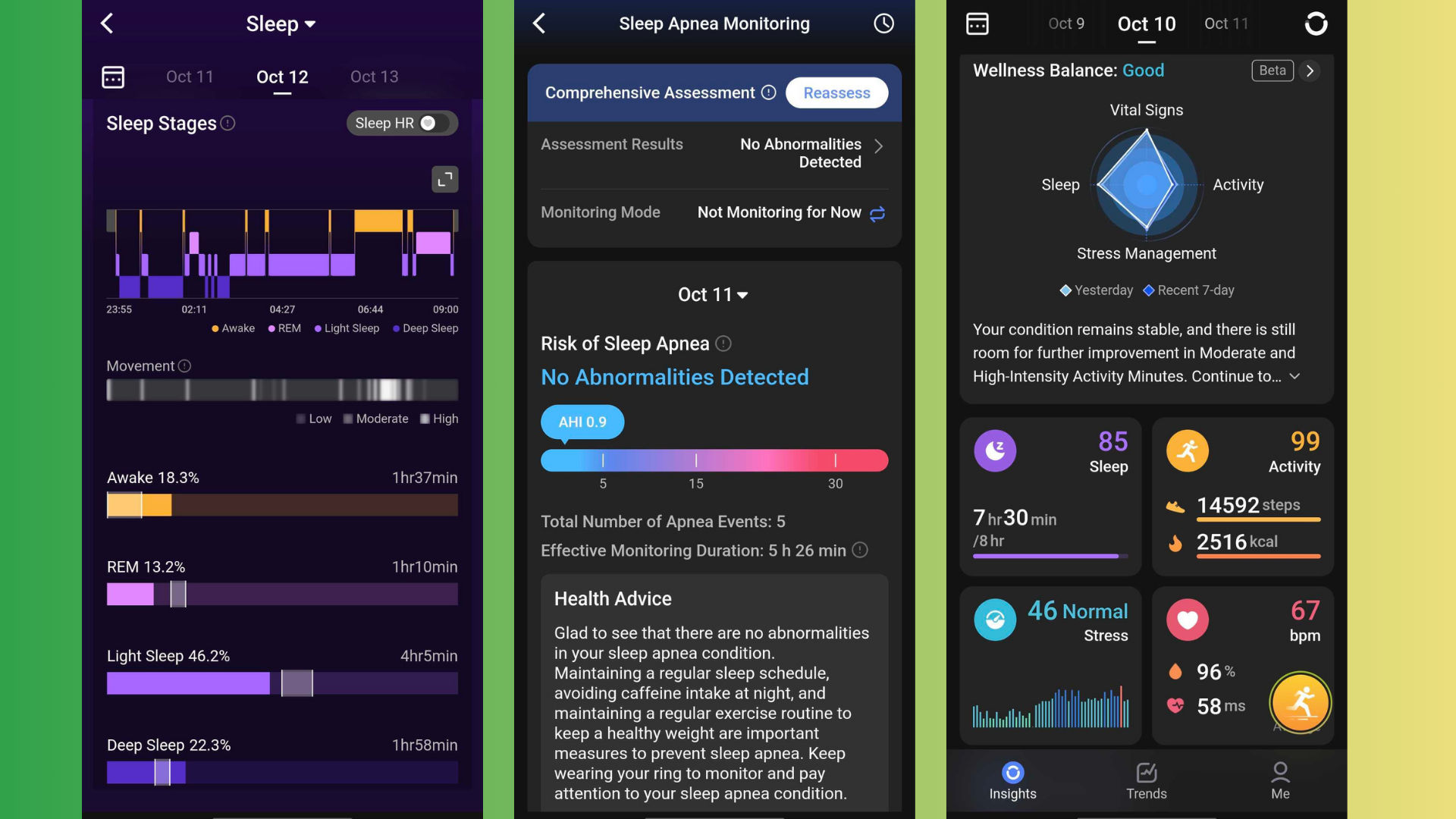
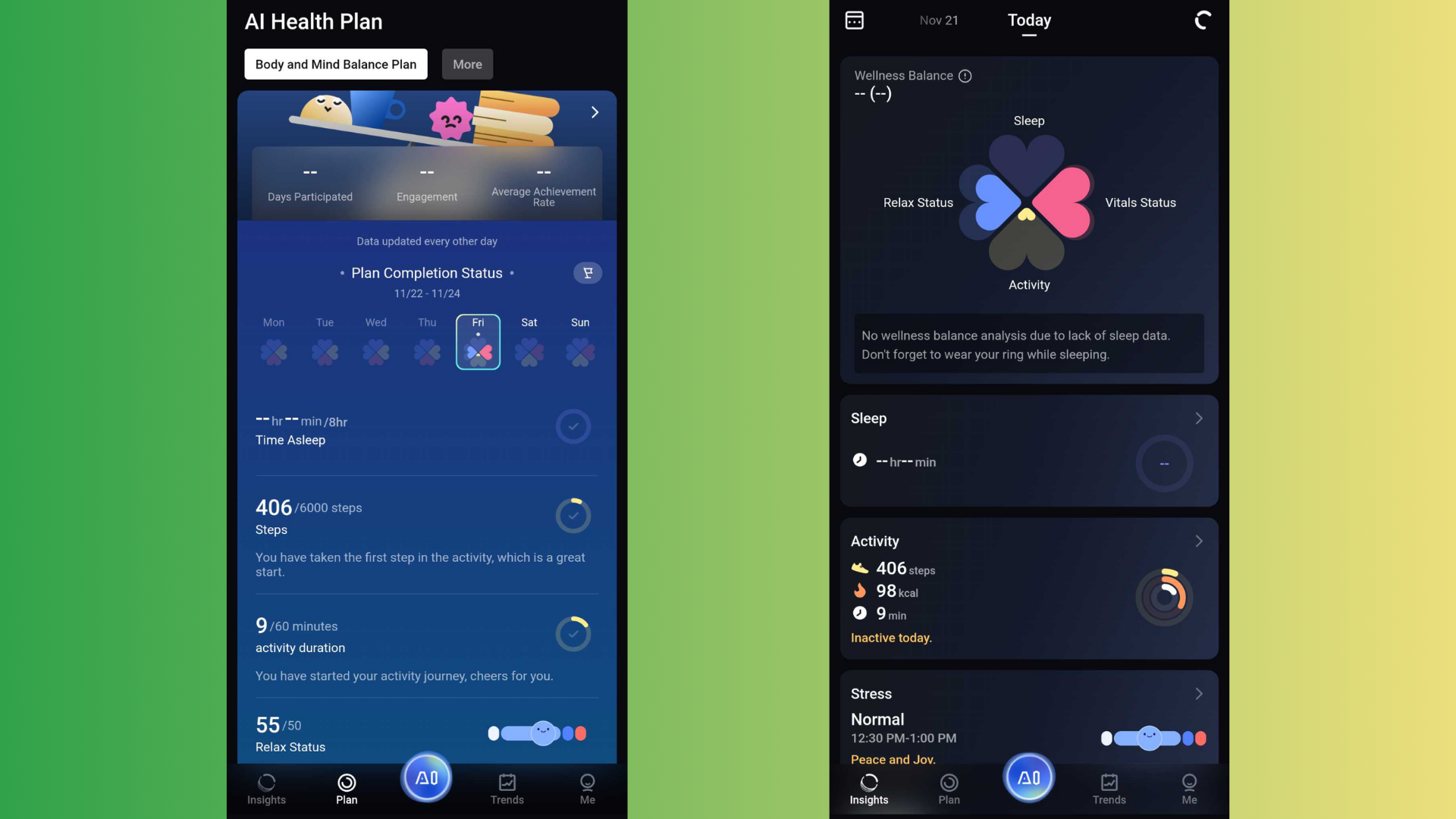
Starting with the obvious style change: the layout remains the same, but the various charts and graphs have been visually adjusted. For example, the wellness balance chart on the app’s main page has changed from a diamond-like design to a much more readable flower-like design.
The corresponding petal will fill in as you improve your activity, sleep, relaxation status, and vital status scores. It’s very similar to the previous chart, except it’s significantly more understandable at a glance.
These clarity improvements extend to other aspects of the homepage and stats pages, but let’s talk about new features. AI has come to the RingConn app in a big way with the introduction of Health Plans.
The first of these plans to launch is a Body and Mind Balance plan – there’s apparently a sleep improvement plan on the way, according to the app – and after answering a short survey about your activity patterns, the software will give you specific daily goals to achieve, so you can steadily transition from your current routine to your new, healthier normal.
There’s also an AI chatbot you can talk to, but as the app notes, it can only respond to set questions. Because of this limitation, it isn’t the most useful because it repackages the insights the app already gives you. Still, as it developed, I could see the AI becoming a useful fitness companion.
A reason to use the app
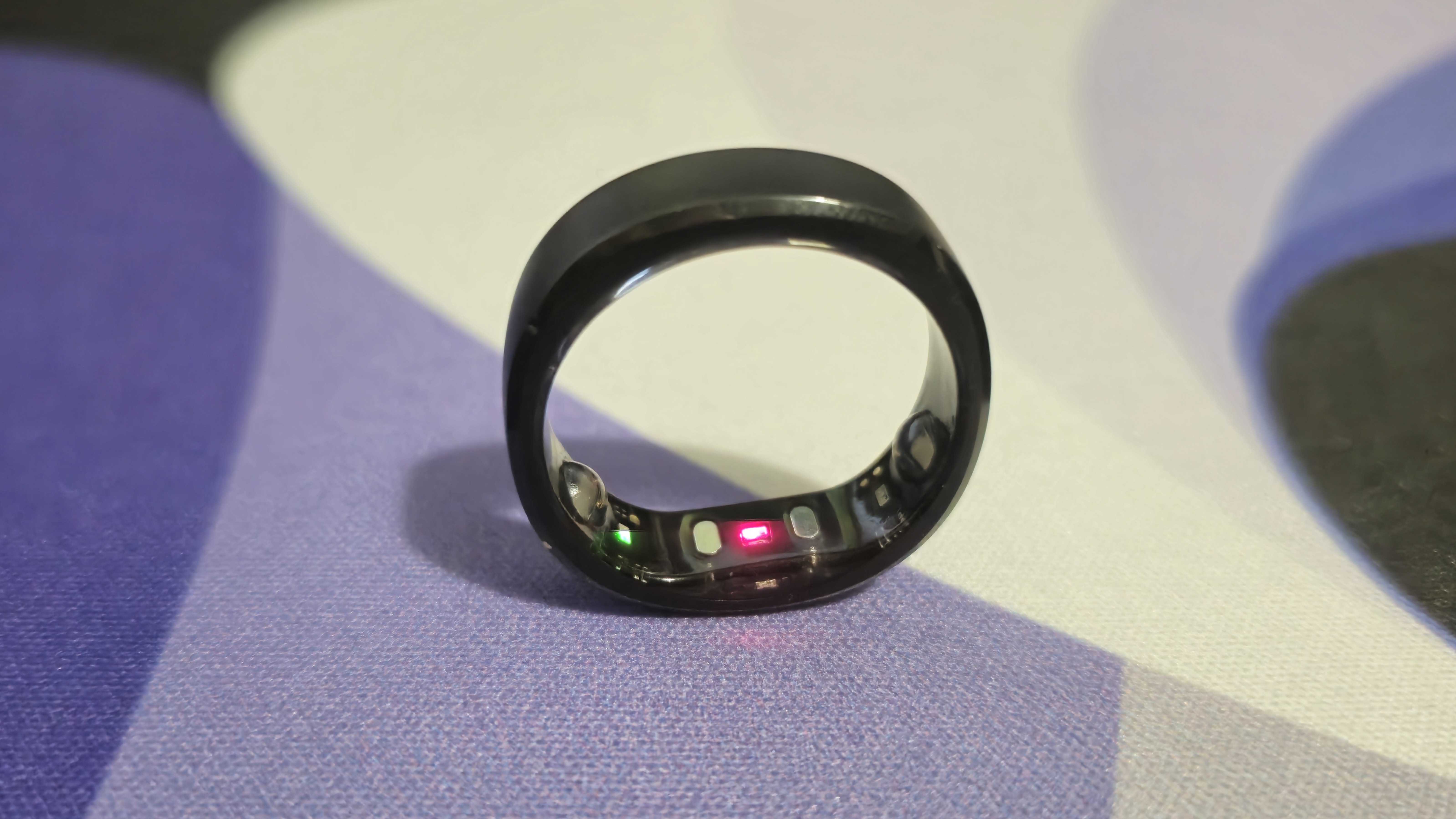
Since I tested the RingConn Gen 2 for our review, I’ve continued to use the ring pretty much all the time—aside from a week or two of misplacement (it fell behind my nightstand)—but I realized I was relying more and more on the app a lot less so because the metrics I cared about most were easily visible in the Android app widget. I could easily check my sleep, activity score, and ring battery with just a quick glance at my home screen.
The in-depth insights were helpful, but I often just wanted a quick summary of my metrics and a quick guide to improvement. The app’s facelift and health plan tool is perfect and gives me a reason to open it more often because I can now get those extra details and daily goals in a concise, quick-read way.
As I said above, the Ai doesn’t feel entirely useful, but overall this overhaul of the RingConn app seems to be a huge boost rather than a downgrade, and I’m curious to see what improvements we get next.

