Windows 11 users, good news: the Start menu can get a fresh new look to make your apps more manageable

Many of the recent changes to the Windows 11 Start menu that Microsoft has tested have been met with mixed reactions. Still, that hasn’t stopped the software giant from continuing to experiment with the menu. It’s currently testing out a new “Category” layout, which we learned about last month.
This layout is an alternative to the default presentation of the Start menu’s “All Apps” section, in addition to a new grid-based layout that Microsoft has also been testing. We’ve already seen a hint of this new category viewand that preview showed solid colored squares arranged in blocks of four (indicating that this was an early, working version of the layout).
Since a new build arrived in the Windows 11 Beta channel, the category organization is now working, or at least somewhat functional, as Windows Latest Reports(Keep in mind, though, that the layout is still hidden in Windows 11. Testers will have to dig to find it.)

Become neater and more organized with apps
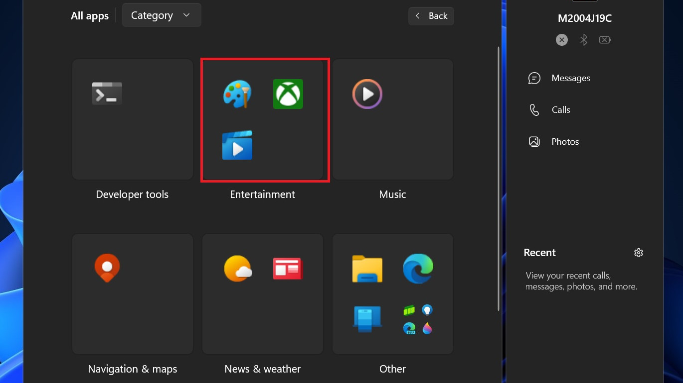
This more polished version of the Category layout now shows single app icons instead of just colored blocks as was previously the case. Each themed category – such as Entertainment, Music, or News & Weather – shows up to four icons of installed apps in a 2 x 2 grid. This grid can show more than four apps, however, by bundling up to four of them together as mini-icons – as you can see in the screenshot above, in the “Other” category – for a total of 16 apps that can be listed in each category (in theory, as things currently stand in testing).
That said, none of this is fully functional in the beta yet. The mini-icons are supposed to expand when you click on them, but they don’t yet. Microsoft may change things (or even scrap the idea) as testing progresses.
Both the Category and Grid layouts are said to be better options than the default Windows 11 Start menu layout up until now, which shows a long list of apps that is painful to scroll through. The Grid view arranges apps alphabetically in a grid, meaning less scrolling, and the Category layout refines things even further with theme groupings to make it easier to sort through your apps.
Just reading about these Start menu updates makes me nostalgic for older Start menu designs where you could immediately see all of your apps organized into select categories.
Windows Latest expects the new category organization to be functional soon, and perhaps even implemented in the next major Windows 11 update, version 24H2. But since the feature is currently in early testing, I’m not sure how realistic that expectation is.


